Statistical Graphics

Trumbo’s Taxes

April 15th, 2014  |  Published in Data, Statistical Graphics

Having filed my taxes in my customarily last-minute fashion, I thought I'd get in on the tax day blogging thing. Via [Sarah Jaffe](http://adifferentclass.com/), I came upon the following interesting passage from Victor Navasky's history of the Hollywood blacklist, [*Naming Names*](http://www.amazon.com/Naming-Names-Victor-S-Navasky/dp/0809001837):

> Conversely, during the blacklist years, which were also tight money years for the studios, agents often found it simpler to hint to their less talented clients that their difficulties were political rather than intrinsic. Since agents as a class follow the money, it is perhaps a clue to the environment of fear within which they operated that, for example, the Berg-Allenberg Agency was, even in late 1948, ready, eager, willing, and able to lose its most profitable client, Dalton Trumbo (at $3000 per week he was one of the highest paid writers in Hollywood)---and this even before the more general system of blacklisting had gone into effect.

The first thing that struck me about this that wow, that's a lot of money. It's not clear where the figure came from. But Navasky did interview Trumbo for the book, so I have to assume it came from the man himself. Now, presumably Trumbo wasn't working all the time, but rather getting picked up for various jobs with slack periods in between. But supposing for a moment that he did: $3000 a week (or $156,000 a year) would be a pretty cushy life *now*, so it would have been an astronomical amount of money in 1948. (And it's highly likely that there were people in Hollywood who were making that much. Ben Hecht is said to have gotten [$10,000 a week](http://www.imdb.com/name/nm0372942/bio).)

The second thing is to note that even being as rich and famous as Dalton Trumbo wasn't enough to protect him from the blacklist. In general, of course, the rich stick together and protect their own. But there are some lines you still can't cross, and the blacklist was one of them. In the end, ideological discipline trumped the solidarity of rich people. Which is what makes the rare radical defectors from the ruling class so significant.

But my final thought was, I wonder what Trumbo's net income would have been, had he made that much money? After all, that was the heyday of high marginal tax rates in the United States, those legendary 90 percent tax brackets that seem so unimaginable to people now. So I got to wondering how much Trumbo would have paid in taxes then, and how much he would have paid on a comparable amount of money today.

Fortunately, the Tax Foundation provides excellent data on historical tax rates. I used the spreadsheet [here](http://taxfoundation.org/sites/taxfoundation.org/files/docs/fed_individual_rate_history_nominal_adjusted-2013_0523.xls), which describes the federal income tax regimes from 1913 to 2013. Using that data, we can get a rough approximation of how much our hypothetical Dalton Trumbo would have paid in taxes, although of course it doesn't take into account any particular deductions or loopholes that may have played into an individual situation---and it's well known that few people actually paid the very high marginal rates of that time. So take this as a quick sketch, meant to demonstrate two things. First, how much our tax rates have changed, and second, how marginal tax rates really work.

Here's a table showing how Trumbo's income would have broken down in 1948. Each line shows a single tax bracket. The first three lines show that rate at which income in that bracket was taxed, and the lower and upper bounds that defined which income was taxed at that rate. The last two columns show how much income Trumbo received in each bracket, and how much tax he would have owed on it.

Tax Rate Over But Not Over Income Taxes
20.0% $0 $2,000 $2,000 $400.00
22.0% $2,000 $4,000 $2,000 $440.00
26.0% $4,000 $6,000 $2,000 $520.00
30.0% $6,000 $8,000 $2,000 $600.00
34.0% $8,000 $10,000 $2,000 $680.00
38.0% $10,000 $12,000 $2,000 $760.00
43.0% $12,000 $14,000 $2,000 $860.00
47.0% $14,000 $16,000 $2,000 $940.00
50.0% $16,000 $18,000 $2,000 $1,000.00
53.0% $18,000 $20,000 $2,000 $1,060.00
56.0% $20,000 $22,000 $2,000 $1,120.00
59.0% $22,000 $26,000 $4,000 $2,360.00
62.0% $26,000 $32,000 $6,000 $3,720.00
65.0% $32,000 $38,000 $6,000 $3,900.00
69.0% $38,000 $44,000 $6,000 $4,140.00
72.0% $44,000 $50,000 $6,000 $4,320.00
75.0% $50,000 $60,000 $10,000 $7,500.00
78.0% $60,000 $70,000 $10,000 $7,800.00
81.0% $70,000 $80,000 $10,000 $8,100.00
84.0% $80,000 $90,000 $10,000 $8,400.00
87.0% $90,000 $100,000 $10,000 $8,700.00
89.0% $100,000 $150,000 $50,000 $44,500.00
90.0% $150,000 $200,000 $6,000 $5,400.00
91.0% $200,000 - $0 $0.00

This is a nice illustration of how marginal tax rates work. There is still, unbelievably, widepread confusion about this. People think that if the marginal tax rate is 90 percent on income over $150,000---as it was in 1948---then that means you'll only keep 10 percent of all your income if you make that much money. But Trumbo wouldn't pay 90 percent on all of his $156,000, only on the $6000 that was over the $150,000 threshold.

So what was Trumbo's real, overall tax rate? The tax figures above sum up to a total bill of $117,220. The Tax Foundation data also describes some additional reductions that were applied that year: 17 percent on taxes up to $400, 12 percent on taxes from $400 to $100,000, and 9.75 percent on taxes above $100,000. Taking those reductions into account, the tax bill comes down to $103,521.

So Trumbo would have had a net income of $52,479 in 1948, for an effective tax rate of 66 percent. Now, that's not 90 percent, but some will surely say that this seems like an unreasonably high level, for reasons of fairness or work incentives or whatever. But let's keep in mind just how where our Trumbo falls in the 1948 United States' distribution of income. Here's a graphical representation of the above data:

trumbo1948

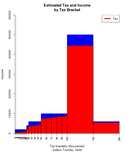
Each bar is a tax bracket. The width of the bar shows how wide the bracket is, while the height shows the income earned in that bracket. The red-shaded portion shows how much of that income was paid in tax. This is a bit visually misleading, because the amount of income in each bar corresponds only to the *height* of the box, not its volume. But I'll swallow my data-visualization pride for the sake of a quick blog post.

A few things to note about this graph. You can see how much of the income in the higher brackets was taxed away, due to the extremely high rates there. You can also see that the tax system is progressive, because the height of the red bars slopes upward, even when the amount of money contained in the brackets remains the same. But the most important thing to pay attention to is that dotted line that you can barely see on the far left. That's the median personal income in the United States for 1948, which according to the Census Bureau was around $1900. In other words, almost all of this would have been irrelevant to half the population, who would have paid just the lowest rate, 20 percent, on all of their income.

If we adjust Trumbo's income for inflation with the [Consumer Price Index](https://www.census.gov/hhes/www/income/data/incpovhlth/2012/CPI-U-RS-Index-2012.pdf), his income would be equivalent to over 1.5 million dollars today. And the tax bill would have been over 1 million dollars. But how would that kind of pay be taxed now? Here's a table like the one above, except applying current tax rates to Trumbo's inflation-adjusted pay:

Tax Rate Over But Not Over Income Taxes
10.0% $0 $17,850 $17,850 $1,785.00
15.0% $17,850 $72,500 $54,650 $8,197.50
25.0% $72,500 $146,400 $73,900 $18,475.00
28.0% $146,400 $223,050 $76,650 $21,462.00
33.0% $223,050 $398,350 $175,300 $57,849.00
35.0% $398,350 $450,000 $51,650 $18,077.50
39.6% $450,000   $1,066,944 $422,509.82

What a difference 65 years and two generations of neoliberalism makes! Now Trumbo's effective tax rate is only 36.15 percent, and he takes home $968,000 after a $548,000 tax bill. To finish things up, here's a graphical representation like the one above:

trumbo2013

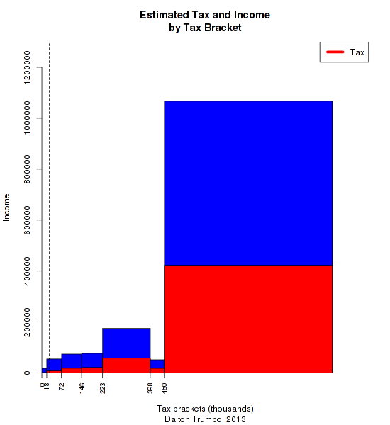
This time, most of the income falls into the top bracket. But since the rate there is only 39.6 percent, our hypothetical 2013 Trumbo still keeps most of his money. And once again, these brackets are mostly irrelevant to most of the population---note the line marking median income.

The punchline to this story, of course, is that it was things like the Hollywood blacklist that helped set the stage for the period of conservative reaction that gave us these tax rates. Check this nice [documentary](http://www.netflix.com/WiMovie/Trumbo/70081095) on Dalton Trumbo to get a sense of a Hollywood radical who puts most of our contemporary celebrity liberals to shame.

*The spreadsheet used to estimate these figures is [here](http://www.peterfrase.com/wordpress/wp-content/uploads/2014/04/TrumboTaxes.xlsx), if you care to play with it yourself.*

The Recession and the Decline in Driving

August 19th, 2011  |  Published in Data, Social Science, Statistical Graphics, Statistics

Jared Bernstein [recently posted](http://jaredbernsteinblog.com/miles-to-go-before-we-sleep/) the graph of U.S. Vehicle Miles Traveled released by the Federal Highway Administration. Bernstein notes that normally, recessions and unemployment don't affect our driving habits very much--until the recent recession, miles traveled just kept going up. That has changed in recent years, as VMT still hasn't gotten back to the pre-recession peak. Bernstein:

> What you see in __the current period is a quite different—a massive decline in driving over the downturn with little uptick since.__ Again, both high unemployment and high [gas] prices are in play here, so there may be a bounce back out there once the economy gets back on track. But it bears watching—__there may be a new behavioral response in play, with people's driving habits a lot more responsive to these economic changes than they used to be.__

> Ok, but what's the big deal? Well, I've generally been skeptical of arguments about "the new normal," thinking that __much of what we're going through is cyclical__, not structural, meaning things pretty much revert back to the old normal once we're growing in earnest again. __But it's worth tracking signals like this that remind one that at some point, if it goes on long enough, cyclical morphs into structural.__

Brad Plumer [elaborates](http://www.washingtonpost.com/blogs/ezra-klein/post/why-are-americans-driving-less/2011/08/18/gIQAUv7tNJ_blog.html):

> __What could explain this cultural shift? Maybe more young people are worried about the price of gas or the environment.__ But—and this is just a theory—technology could play a role, too. Once upon a time, newly licensed teens would pile all their friends into their new car and drive around aimlessly. For young suburban Americans, it was practically a rite of passage. Nowadays, however, __teens can socialize via Facebook or texting__ instead—in the Zipcar survey, more than half of all young adults said they'd rather chat online than drive to meet their friends.

> But that's all just speculation at this point. As Bernstein says, __it's still unclear whether the decline in driving is a structural change or just a cyclical shift that will disappear once (if) the U.S. economy starts growing again.__

Is it really plausible to posit this kind of cultural shift, particularly given the evidence about the [price elasticity of oil](http://motherjones.com/kevin-drum/2011/04/raw-data-everyone-loves-oil)? As it happens, I did a bit of analysis on this point a couple of years ago. Back then, Nate Silver wrote a [column](http://www.esquire.com/features/data/nate-silver-car-culture-stats-0609) in which he tried to use a regression model to address this question of whether the decline in driving was a response to economic factors or an indication of a cultural trend. Silver argued that economic factors--in his model, unemployment and gas prices--couldn't completely explain the decline in driving. If true, that result would support the "cultural shift" argument against the "cyclical downturn" argument.

I wrote a [series](http://www.peterfrase.com/2009/05/attempt-to-regress/) [of](http://www.peterfrase.com/2009/05/predictin/) [posts](http://www.peterfrase.com/2009/05/one-last-time/) in which I argued that with a more complete model--including wealth and the lagged effect of gas prices--the discrepancies in Silver's model seemed to disappear. That suggests that we don't need to hypothesize any cultural change to explain the decline in driving. You can go to those older posts for the gory methodological details; in this post, I'm just going to post an updated version of one of my old graphs:

Vehicle Miles Traveled: Actual and Regression Predictions

The blue line is the 12-month moving average of Vehicle Miles Travelled--the same thing Bernstein posted. The green and red lines are 12-month moving averages of *predicted* VMT from two different regression models--the Nate Silver model and my expanded model, as described in the earlier post I linked. The underlying models haven't changed since my earlier version of this graph, except that I updated the data to include the most recent information, and switched to the 10-city Case Shiller average for my house price measure, rather than the OFHEO House Price Index that I was using before, but which seems to be an [inferior measure](http://www.calculatedriskblog.com/2008/01/house-prices-comparing-ofheo-vs-case.html).

The basic conclusion I draw here is the same as it was before: a complete set of economic covariates does a pretty good job of predicting miles traveled. In fact, even Nate Silver's simple "gas prices and unemployment" model does fine for recent months, although it greatly overpredicts during the depths of the recession.\* So I don't see any cultural shift away from driving here--much as I would like to, since I personally hate to drive and I wish America wasn't built around car ownership. Instead, the story seems to be that Americans, collectively, have experienced an unprecedented combination of lost wealth, lost income, and high gas prices. That's consistent with graphs like [these](http://thinkprogress.org/yglesias/2011/07/18/271412/the-consumer-bust-and-the-inevitability-of-politics/), which look a lot like the VMT graph.

The larger point here is that we can't count on shifts in individual preferences to get us away from car culture. The entire built environment of the United States is designed around the car--sprawling suburbs, massive highways, meager public transit, and so on. A lot of people can't afford to live in walkable, bikeable, or transit-accessible places even if they want to. Changing that is going to require a long-term change in government priorities, not just a cultural shift.


Below are the coefficients for my model. The data is [here](http://www.peterfrase.com/wordpress/wp-content/uploads/2011/08/silver_driving_2011.csv), and the code to generate the models and graph is [here](http://www.peterfrase.com/wordpress/wp-content/uploads/2011/08/silver_driving_2011.R.txt).

Coef. s.e.

(Intercept) 111.55 2.09

unemp -1.57 0.27

gasprice -0.08 0.01

gasprice_lag12 -0.03 0.01

date 0.01 0.00

stocks 0.58 0.23

housing 0.10 0.01

monthAugust 17.52 1.01

monthDecember -9.21 1.02

monthFebruary -31.83 1.03

monthJanuary -22.90 1.02

monthJuly 17.84 1.02

monthJune 11.31 1.03

monthMarch -0.09 1.03

monthMay 12.08 1.02

monthNovember -10.46 1.01

monthOctober 5.82 1.01

monthSeptember -2.73 1.01

---

n = 234, k = 18

residual sd = 3.16, R-Squared = 0.99

\* *That's important, since you could otherwise argue that the housing variable in my model--which has seen an unprecedented drop in recent years--is actually proxying a cultural change. I doubt that for other reasons, though. If housing is removed from the model, it underpredicts VMT during the runup of the bubble, just as Silver's model does. That suggests that there is some real wealth effect of house prices on driving.*

Redistribution Under Neoliberalism

August 8th, 2011  |  Published in Data, Political Economy, Politics, Social Science, Statistical Graphics, xkcd.com/386

Last week, Seth Ackerman wrote a *Jacobin* [blog post](http://jacobinmag.com/blog/?p=891) in which he gave us a snarky attack on the record of "left neo-liberalism" in the United Kingdom. Basically, he showed that while New Labour managed to reduce poverty somewhat with cash transfer programs, the progress was meager and could not be sustained. Since the programs were financed out of a series of asset bubbles, the UK has seen poverty go back up again with the recent crisis.

I don't have much quarrel with this account, but I'm not sure it can bear the weight of the argument that Seth wants to put on it. He suggests that the UK experience is a refutation of the general strategy of progressive neoliberalism, which Freddie DeBoer felicitously dubbed ["globalize-grow-give"](http://lhote.blogspot.com/2011/01/globalize-grow-give-progressivism-and.html):

> First, you embrace the standard globalization model of reduced or eliminated tariff walls, large free trade agreements such as NAFTA or CAFTA, deregulation, and general trade liberalization. This encourages international trade and the exporting of jobs from highly-regulated, fairly well compensated, high worker standard of living places like the United States to the cheap labor, low regulation, low worker standard of living places like China or Indonesia. This spurs international economic growth in both the exporting and importing countries. Here at home, higher growth results in higher tax revenues which can then be redistributed from those at the top of the income distribution (who have benefited from the globalized trade regime) to those at the bottom of the income distribution (who have been hurt by the globalized trade regime that undercuts their wages and exports their jobs).

I think that if you want to really criticize this view, you need to look beyond the UK, which is neither a very generous nor a particularly well-designed welfare state. As it happens, my day job involves analyzing cross-national income data, so I'm going to perpetrate some social science on y'all.

The way I read the "globalize-grow-give" critique, you can extract an empirical claim about how the income distribution should look in a G-G-G economy. The distribution of income *before* taxes and transfers will become increasingly unequal due to deregulation and globalization, but the distribution *after* taxes and transfers are accounted for will not become vastly more unequal because government is compensating for the inequality in the private market.

To test this, I did some simple calculations, following other researchers who have done [similar](http://www.lisproject.org/publications/liswps/392.pdf) [things](http://www.lisproject.org/publications/liswps/458.pdf). Using data from the [Luxembourg Income Study](http://www.lisdatacenter.org/), I calculated the [Gini coefficient](http://en.wikipedia.org/wiki/Gini_coefficient), a standard measure of inequality, for several different countries. I calculated two different Ginis:

- The Gini of *market income*. Market income is defined here as income from wages, pensions, self-employment and property. This is income *before* any taxes or transfers are accounted for.
- The Gini of *disposable income*. This is the income that people actually have to spend, after taxes are deducted and any transfers are added in. (For more details about the variables, see the postscript).

Unfortunately, the difficulty of harmonizing cross-national data means that the numbers I have access to are a bit out of date--specifically, they end before the current crisis period. I still think we can learn something useful from them, however. The way G-G-G neoliberalism is supposed to work, the Gini of market income should go up but the Gini of disposable income should not--or at least should rise more slowly. We can think of the difference between market income inequality and disposable income inequality as a rough measure of the amount of redistribution done by the state.

So here's what things look like in the UK:

Income Inequality in the UK

This figure basically supports Seth's argument. Market income inequality has gone way up in the last few decades, but disposable income inequality has gone up by a lot as well. The state is doing a bit more redistribution than it used to, but not enough to make up for the rise in private-market inequality. If you look at the United States, the situation is even worse, as the state has done essentially nothing to counter rising inequality in market income:

Income Inequality in the USA

The question, though, is whether it has to be like this. Let's put the UK alongside another rich European economy, Germany:

Income Inequality in the UK and Germany

Here we see something very interesting. Before you take taxes and transfers into account, the rise in inequality in Germany looks very similar to what happened in the UK--indeed, the two countries converge to almost the same value by 2005. But disposable income inequality has stayed flat in Germany, because the German state has used taxes and transfers to counteract rising inequality.

Every good social democrat loves the Nordic model, so let's finish off with a look at Sweden:

Income Inequality in Sweden

Here the story is a bit different--both market income and disposable income inequality have remained pretty flat, although both have risen a bit. The important thing to note here is that even in the most socialist of welfare states, market income inequality is very high, nearly as high as it is in the UK or US. The fact that Sweden is one of the least unequal countries on earth has to do almost entirely with taxes and transfers.

So what can we conclude from all this? Let me be clear that I don't think this is a knock-down argument in favor of "globalize-grow-give" as a political model. But I think the best argument against the G-G-G model is not that it's economically impossible or dependent on asset bubbles. Rather, I'd point us back to the political arguments enumerated by [me](http://www.peterfrase.com/2011/07/policy-politics-and-strategy/), [Henry Farrell](http://crookedtimber.org/2011/07/25/neo-liberalism-the-submerged-state-and-the-politics-of-nudge/), and [Cosma Shalizi](http://cscs.umich.edu/~crshalizi/weblog/778.html) among others. What makes Sweden and Germany different is not that their economies are different from those in the US and UK (although they are), but that they have different political environments, featuring things like a hegemonic Social Democratic party in Sweden and a strong labor movement in Germany.

So if left-neoliberalism is to be a workable political agenda rather than the motto of useful idiots for the "globalize-grow-keep" agenda of the right-wing neoliberals, it has to either make its peace with the sources of working-class power that currently exist, or else come up with workable models of what might replace them.

*[Postscript for income inequality nerds only: the income variables are equivalized for household size using the square root of the number of persons in the household as the equivalence scale. The variables are then topcoded at ten times the equivalized mean and bottom-coded at 1 percent of the equivalized mean.*

*Note that the transfers included in disposable income are only cash transfers and "near-cash" benefits (like food stamps), not in-kind services like health care. So you could argue that this data actually understates the extent of redistribution.*

*If you'd like to look at the data, including a bunch of countries I didn't include in the post, it's [here](http://www.peterfrase.com/wordpress/wp-content/uploads/2011/08/mi_dpi_gini1.csv). For help interpreting the country codes, go [here](http://www.lisdatacenter.org/our-data/lis-database/documentation/list-of-datasets/)]*

Manufacturing Output Around the World

April 11th, 2011  |  Published in Political Economy, Statistical Graphics, Work

I went into excruciating detail about manufacturing output statistics in my last post, mainly so that I could post some more analysis using various international sources. One question that often comes up about American manufacturing, after all, is whether our pattern of deindustrialization is unusual compared to other countries. To get some idea, we can use the statistics on employment and output compiled by the OECD. These numbers are, as best I can tell, roughly comparable to the Federal Reserve "output" numbers I used in my initial post on U.S. manufacturing.

For most countries, the OECD data only goes back a few years. So for some of the most interesting cases--namely, recently industrializing poor countries--we don't have good historical data. However, we can at least compare the U.S. to other rich countries. Here's manufacturing employment and output for the U.S., Sweden, and Japan, going back to 1970:

Here, we see that "deindustrialization" in the sense of declining manufacturing employment is not just a U.S. phenomenon. Likewise, manufacturing output has grown dramatically in all three countries. Indeed, output growth has been faster in the U.S.

This is particularly amusing with respect to Japan. Back in the 1980's, of course, Japan played the role of bête noir in American popular discourse that China plays today: the scary Asian menace that was going to out-compete the U.S. economy and ensure our economic doom. And indeed, output and employment in manufacturing both grew faster in Japan than in the U.S. in the 1980's. But since then, Japan has followed the same pattern of employment decline as the United States, while its output has remained stagnant. This is worth keeping in mind when considering the likely future of manufacturing in today's low-wage countries.

But what if we expand our view to include some more recently industrialized countries? Given the available data, we are unfortunately limited to just the most recent business cycle. Still, there are some interesting patterns:

Now some different patterns emerge. The U.S., Germany and especially Korea show the pattern of divergence between employment and output. In South Africa and Turkey, on the other hand, the two are more closely linked. Turkey, in fact, shows an actual increase in the number of manufacturing employees, unlike any of these other countries. This is likely due to a combination of low Turkish wages and proximity to EU markets--along with the anticipation of possible future Turkish membership in the EU. There are those who would like to "bring back" manufacturing jobs from offshore locations like Turkey. But it's not clear how many jobs this would actually create--Turkish manufacturing is a big employer precisely because it isn't all that productive. Protectionist policies--or increases in wages in the low-wage producers--would probably create some jobs in the rich countries, but they would also probably lead to increased use of labor-saving technology.

Of course, we still haven't dealt with the panda bear in the middle of the room: China. But I'm going to wait and put that one in its own post.

What is output?

April 6th, 2011  |  Published in Statistical Graphics, Statistics

I'm going to do a little series on manufacturing, because after doing my last post I got a little sucked into the various data sources that are available. Today's installment comes with a special attention conservation notice, however: this post will be extremely boring. I'll get back to my substantive arguments about manufacturing in future posts, and put up some details about trends in productivity in specific sectors, some data that contextualizes the U.S. internationally, and a specific comparison with China. But first, I need to make a detour into definitions and methods, just so that I have it for my own reference. What follows is an attempt to answer a question I've often wanted answered but never seen written up in one place: what, exactly, do published measures of real economic growth actually mean?

The two key concepts in my previous post are manufacturing employment and manufacturing output. The first concept is pretty simple--the main difficulty is to define what counts as a manufacturing job, but there are fairly well-accepted definitions that researchers use. In the International Standard Industrial Classification (ISIC), which is used in many cross-national datasets, manufacturing is definied as:

the physical or chemical transformation of materials of components into new products, whether the work is performed by power- driven machines or by hand, whether it is done in a factory or in the worker's home, and whether the products are sold at wholesale or retail. Included are assembly of component parts of manufactured products and recycling of waste materials.

There is some uncertainty about how to classify workers who are only indirectly involved in manufacturing, but in general it's fairly clear which workers are involved in manufacturing according to this criterion.

The concept of "output", however, is much fuzzier. It's not so hard to figure out what the physical outputs of manufacturing are--what's difficult is to compare them, particularly over time. My last post was gesturing at some concept of physical product: the idea was that we produce more things than we did a few decades ago, but that we do so with far fewer people. However, there is no simple way to compare present and past products of the manufacturing process, because the things themselves are qualitatively different. If it took a certain number of person-hours to make a black and white TV in the 1950's, and it takes a certain number of person-hours to make an iPhone in 2011, what does that tell us about manufacturing productivity?

There are multiple sources of data on manufacturing output available. My last post used the Federal Reserve's Industrial Production data. The Fed says that this series "measures the real output of the manufacturing, mining, and electric and gas utilities industries". They further explain that this measure is based on "two main types of source data: (1) output measured in physical units and (2) data on inputs to the production process, from which output is inferred.". Another U.S. government source is the Bureau of Economic Analysis data on value added by industry, which "is equal to an industry’s gross output (sales or receipts and other operating income, commodity taxes, and inventory change) minus its intermediate inputs (consumption of goods and services purchased from other industries or imported)." For international comparisons, the OECD provides a set of numbers based on what they call "indices of industrial production"--which, for the United States, are the same as the Federal Reserve output numbers. And the United Nations presents data for value-added by industry, which covers more countries than the OECD and is supposed to be cross-nationally comparable, but does not quite match up with the BEA numbers.

The first question to ask is: how comparable are all these different measures? Only the Fed/OECD numbers refer to actual physical output; the BEA/UN data appears to be based only on the money value of final output. Here is a comparison of the different measures, for the years in which they are all available (1970-2009). The numbers have all been put on the same scale: percent of the value in the year 2007.

Comparison of value added and physical output measures of manufacturing

The red line shows the relationship between the BEA value added numbers and the Fed output numbers, while the blue line shows the comparison between the UN value-added data and the Fed output data. The diagonal black line shows where the lines would fall if these two measures were perfectly comparable. While the overall correlation is fairly strong, there are clear discrepancies. In the pre-1990 data, the BEA data shows manufacturing output being much lower than the Fed's data, while the UN series shows somewhat higher levels of output. The other puzzling result is in the very recent data: according to value-added, manufacturing output has remained steady in the last few years, but according to the Fed output measure it has declined dramatically. It's hard to know what to make of this, but it does suggest that the Great Recession has created some issues for the models used to create these data series.

What I would generally say about these findings is that these different data sources are sufficiently comparable to be used interchangeably in making the points I want to make about long-term trends in manufacturing, but they are nevertheless different enough that one shouldn't ascribe unwarranted precision to them. However, the fact that all the data are similar doesn't address the larger question: how can we trust any of these numbers? Specifically, how do government statistical agencies deal with the problem of comparing qualitatively different outputs over time?

Contemporary National Accounts data tracks changes in GDP using something called a "chained Fisher price index". Statistics Canada has a good explanation of the method. There are two different problems that this method attempts to solve. The first is the problem of combining all the different outputs of an economy at a single point in time, and the second is to track changes from one time period to another. In both instances, it is necessary to distinguish between the quantity of goods produced, and the prices of those goods. Over time, the nominal GDP--that is, the total money value of everything the economy produces--will grow for two reasons. There is a "price effect" due to inflation, where the same goods just cost more, and a "volume effect" due to what StatCan summarizes as "the change in quantities, quality and composition of the aggregate" of goods produced.

StatCan describes the goal of GDP growth measures as follows: "the total change in quantities can only be calculated by adding the changes in quantities in the economy." Thus the goal is something approaching a measure of how much physical stuff is being produced. But they go on to say that:

creating such a summation is problematic in that it is not possible to add quantities with physically different units, such as cars and telephones, even two different models of cars. This means that the quantities have to be re evaluated using a common unit. In a currency-based economy, the simplest solution is to express quantities in monetary terms: once evaluated, that is, multiplied by their prices, quantities can be easily aggregated.

This is an important thing to keep in mind about output growth statistics, such as the manufacturing output numbers I just discussed. Ultimately, they are all measuring things in terms of their price. That is, they are not doing what one might intuitively want, which is to compare the actual amount of physical stuff produced at one point with the amount produced at a later point, without reference to money. This latter type of comparison is simply not possible, or at least it is not done by statistical agencies. (As an aside, this is a recognition of one of Marx's basic insights about the capitalist economy: it is only when commodities are exchanged on the market, through the medium of money, that it becomes possible to render qualitatively different objects commensurable with one another.)

In practice, growth in output is measured using two pieces of information. The first is the total amount of a given product that is sold in a given period. Total amount, in this context, does not refer to a physical quantity (it would be preferable to use physical quanitites, but this data is not usually available), but to the total money value of goods sold. The second piece of information is the price of a product at a given time point, which can be compared to the price in a previous period. The "volume effect"--that is, the actual increase in output--is then defined as the change in total amount sold, "deflated" to account for changes in price. So, for example, say there are $1 billion worth of shoes sold in period 1, and $1.5 billion worth of shoes sold in period 2. Meanwhile, the price of a pair of shoes rises from $50 to $60 between periods 1 and two. The "nominal" change in shoe production is 50%--that is, sales have increased from 1 billion to 1.5 billion. But the real change in the volume of shoes sold is defined as:

\frac{\frac{\$50}{\$60}*\$1.5 billion}{\$1 billion} = 1.25

So after correcting for the price increase, the actual increase in the amount of shoes produced is 25 percent. Although the example is a tremendous simplification, it is in essence how growth in output is measured by national statistical agencies.

In order for this method to work, you obviously need good data on changes in price. Governments traditionally get this information with what's called a "matched model" method. Basically, they try to match up two identical goods at two different points in time, and see how their prices change. In principle, this makes sense. In practice, however, there is an obvious problem: what if you can't find a perfect match from one time period to another? After all, old products are constantly disappearing and being replaced by new ones--think of the transition from videotapes to DVDs to Blu-Ray discs, for example. This has always been a concern, but the problem has gotten more attention recently because of the increasing economic importance of computers and information technology, which are subject to rapid qualitative change. For example, it's not really possible to come up with a perfect match between what a desktop computer cost ten years ago and what it costs today, because the quality of computers has improved so much. A $1000 desktop from a decade ago would be blown away by the computing power I currently have in my phone. It's not possible to buy a desktop in 2011 that's as weak as the 2000 model, any more than it was possible to buy a 2011-equivalent PC ten years ago.

Experts in national accounts have spent a long time thinking about this problem. The OECD has a very useful handbook by price-index specialist Jack Triplett, which discusses the issues in detail. He discusses both the traditional matched-model methods and the newer "hedonic pricing" methods for dealing with the situation where an old product is replaced by a qualitatively different new one.

Traditional methods of quality adjustment are based on either measuring or estimating the price of the new product and the old one at a single point in time, and using this as the "quality adjustment". So, for example, if a new computer comes out that costs $1000, and it temporarily exists in the market alongside another model that costs $800, then the new computer is assumed to be 20 percent "better" than the old one, and this adjustment is incorporated into the price adjustment. The intuition here is that the higher price of the new model is not due to inflation, as would be assumed in the basic matched-model framework, but reflects an increase in quality and therefore an increase in real output.

Adapting the previous example, suppose revenues from selling computers rise from $1 billion to $1.5 billion dollars between periods 1 and 2, and assume for simplicity that there is just one computer model, which is replaced by a better model between the two periods. Suppose that, as in the example just given, the new model is priced at $1000 when introduced at time 1, compared to 800 for the old model. Then at time 2, the old model has disappeared, while the new model has risen in price to $1200. As before, nominal growth is 50 percent. With no quality adjustment, the real growth in output is:

\frac{\frac{\$1000}{\$1200}*\$1.5 billion}{\$1 billion} = 1.25

Or 25 percent growth. If we add a quality adjustment reflecting the fact that the new model is 20 percent "better", however, we get:

\frac{\frac{\$1000}{\$800} * \frac{\$1000}{\$1200} * \$1.5 billion}{\$1 billion} = 1.56

Meaning that real output has increased by 56 percent, or more than the nominal amount of revenue growth, even adjusting for inflation.

In practice, it's often impossible to measure the prices of old and new models at the same time. There are a number of methods for dealing with this, all of which amount to some kind of imputation of what the relative prices of the two models would have been, had they been observed at the same time. In addition, there are a number of other complexities that can enter into quality adjustments, having to do with changes in package size, options being made standard, etc. For the most part, the details of these aren't important. One special kind of adjustment that is worth noting is the "production cost" adjustment, which is quite old and has been used to measure, for example, model changes in cars. In this method, you survey manufacturers and ask them: what would it have cost you to build your new, higher-quality model in an early period? So for a computer, you would ask: how much would it have cost you to produce a computer as powerful as this year's model, if you had done it last year? However, Triplett notes that in reality, this method tends not to be practical for fast-changing technologies like computers.

Although they are intuitively appealing, it turns out that the traditional methods of quality adjustment have many potential biases. Some of them are related to the difficulty of estimating the "overlapping" price of two different models that never actually overlapped in the market. But even when such overlapping prices are available, there are potential problems: older models may disappear because they did not provide good quality for the price (meaning that the overlapping model strategy overestimates the value of the older model), or the older model may have been temporarily put on sale when the new model was introduced, among other issues.

The problems with traditional quality adjustments gave rise to an alternative method of "hedonic" price indexes. Where the traditional method simply compares a product with an older version of the same product, hedonic indices use a model called a "hedonic function" to predict a product's price based on its characteristics. Triplett gives the example of a study of mainframe computers from the late 1980's, in which a computer's price was modeled as a function of its processor speed, RAM, and other technical characteristics.

The obvious advantage of the hedonic model is that it allows you to say precisely what it is about a new product that makes it superior to an old one. The hedonic model can either be used as a supplement to traditional method, as a way of dealing with changes in products, or it can entirely replace the old methods based on doing one-to-one price comparisons from one time period two another.

The important thing to understand about all of these quality-adjustment methodologies is what they imply about output numbers: growth in the output of the economy can be due to making more widgets, or to making the same number of widgets but making them better. In practice, of course, both types of growth are occuring at the same time. As this discussion shows, quality adjustments are both unavoidable and highly controversial, and they introduce an unavoidable subjective element into the definition of economic output. This has to be kept in mind when using any time series of output over time, since these numbers will reflect the methdological choices of the agencies that collected the data.

Despite these caveats, however, wading into this swamp of technical debates has convinced me that the existing output and value-added numbers are at least a decent approximation of the actual productivity of the economy, and are therefore suitable for making my larger point about manufacturing: the decline of manufacturing employment is less a consequence of globalization than it is a result of technological improvements and increasing labor productivity.

The United States Makes Things

April 4th, 2011  |  Published in Political Economy, Social Science, Statistical Graphics, Work

The other day I got involved in an exchange with some political comrades about the state of manufacturing in the United States. We were discussing this Wall Street Journal editorial, which laments that "more Americans work for the government than work in construction, farming, fishing, forestry, manufacturing, mining and utilities combined". Leaving aside the typical right-wing denigration of government work, what should we think about the declining share of of Americans working in industries that "make things"?

I've written about this before. But I'm revisiting the argument in order to post an updated graph and also to present an alternative way of visualizing the data.

Every time I hear a leftist or a liberal declare that we need to create manufacturing jobs or start "making things" again in America, I want to take them by the collar and yell at them. Although there is a widespread belief that most American manufacturing has been off-shored to China and other low-wage producers, this is simply not the case. As I noted in my earlier post, we still make lots of things in this country--more than ever, in fact. We just do it with fewer people. The problem we have is not that we don't employ enough people in manufacturing. The problem is that the immense productivity gains in manufacturing haven't accrued to ordinary people--whose wages have stagnated--but have instead gone to the elite in the form of inflated profits and stock values.

Anyway, I'm revisiting this because I think everyone on the left needs to get the facts about manufacturing employment and output burned into their memory. The numbers on employment in manufacturing are available from the St. Louis Federal Reserve, and the data on output is available from the national Federal Reserve site. Here's an updated version of a graph I've previously posted:

Manufacturing Output and Employment (1)

I like this graph a lot, but today I had another idea for how to visualize these two series. Over at Andrew Gelman's blog, co-blogger Phil posted an interesting graph of bicycing distance and fatalities. That gave me the idea of using the same format for the manufacturing data:

Manufacturing Output and Employment (2)

This graph is interesting because it seems to show three pretty different eras in manufacturing. From the 1940's until around 1970, there was a growth in both employment and output. This, of course, corresponds to the "golden age" of post-war Keynesianism, where the labor movement submitted to capitalist work discipline in return for receiving a share of productivity gains in the form of higher wages. From 1970 until around 2000, output continues to rise rapidly, but employment stays basically the same. Then in the last ten years, employment falls dramatically while output remains about the same.

This big take-home point from all this is that manufacturing is not "in decline", at least in terms of output. Going back to an economy with tons of manufacturing jobs doesn't make any more sense than going back to an economy dominated by agricultural labor--due to increasing productivity, we simply don't need that many jobs in these sectors. Which means that if we are going to somehow find jobs for 20 million unemployed and underemployed Americans, we're not going to do it by building up the manufacturing sector.

Obligatory Google Ngram Post

December 20th, 2010  |  Published in Data, Social Science, Statistical Graphics, Time

It appears that everyone with a presence on the Internet is obligated to post some kind of riff on the [amazing Google Ngram Viewer](http://ngrams.googlelabs.com/info). Via Henry Farrell, I see that Daniel Little has attempted to [perpetrate some social science](http://understandingsociety.blogspot.com/2010/12/new-tool-for-intellectual-history.html), which made me think that perhaps while I'm at it, I can post something that actually relates to my dissertation research for a change. Hence, this:

Instances of the phrases "shorter hours" and "higher wages" in the Google ngram viewer.

Click for a bigger version, but the gist is that the red line indicates the phrase "higher wages", and the blue line is "shorter hours". Higher wages have a head start, with hours not really appearing on the agenda until the late 19th century. That's a bit later than I expected, but it's generally consistent with what I know about hours-related labor struggle in the 19th century.

The 20th century is the more interesting part of the graph in any case. For a while, it seems that discussion of wages and hours moves together. They rise in the period of ferment after World War I, and again during the depression. Both decline during World War II, which is unsurprising--both wage and hour demands were subordinated to the mobilization for war. But then after the war, the spike in mentions of "higher wages" greatly outpaces mentions of "shorter hours"--the latter has only a small spike, and thereafter the phrase enters a secular decline right through to the present.

Interest in higher wages appears to experience a modest revival in the 1970's, corresponding to the beginnings of the era of wage stagnation that we are still living in. But for the first time, there is no corresponding increase in discussion of shorter hours. This is again not really surprising, since the disappearance of work-time reduction from labor's agenda as been widely remarked upon. But it's still pretty interesting to see such evidence of it in the written corpus.

Republican Census Protestors: Myth or Reality?

April 1st, 2010  |  Published in Politics, Statistical Graphics, Statistics

April 1 is "Census Day", the day on which you're supposed to have turned in your response to the 2010 census. Of course, lots of people haven't returned their form, and the Census Bureau even has a map where you can see how the response rates look in different parts of the country.

Lately, there's been a lot of talk about the possibility that conservatives are refusing to fill out the census as a form of protest. This behavior has been encouraged by the anti-census rhetoric of elected officials such as Representatives Michelle Bachman (R-MN) and Ron Paul (R-TX).  In March, the Houston Chronicle website reported that response rates in Texas were down, especially in some highly Republican areas. And conservative Republican Patrick McHenry (R-NC) was so concerned about this possible refusal--which could lead conservative areas to lose federal funding and even congressional representatives--that he went on the right-wing site redstate.com to encourage conservatives to fill out the census.

Thus far, though, we've only heard anecdotal evidence that right-wing census refusal is a real phenomenon. Below I try to apply more data to the question.

The Census Bureau provides response rates by county in a downloadable file on their website.  The data in this post were downloaded on April 1. To get an idea of how conservative a county is, we can use the results of the 2008 Presidential election, and specifically Republican share of the two-party vote--that is, the percentage of people in a county who voted for John McCain, with third-party votes excluded. The results look like this:

It certainly doesn't look like there's any overall trend toward lower participation in highly Republican counties, and indeed the correlation between these two variables is only -0.01. In fact, the highest participation seems to be in counties that are neither highly Democratic nor highly Republican, as shown by the trend line.

So, myth: busted? Not quite. There are some other factors that we should take into account that might hide a pattern of conservative census resistance. Most importantly, many demographic groups that tend to lean Democratic, such as the poor and non-whites, are also less likely to respond to the census. So even if hostility to government were holding down Republican response rates, they still might not appear to be lower than Democratic response rates overall.

Fortunately, the Census Bureau has a measure of how likely people in a given area are to be non-respondents to the census, which they call the "Hard to Count score". This combines information on multiple demographic factors including income, English proficiency, housing status, education, and other factors that may make people hard to contact. My colleagues Steve Romalewski and Dave Burgoon have designed an excellent mapping tool that shows the distribution of these hard-to-count areas around the county, and produced a report on the early trends in census response around the country.

We can test the conservative census resistance hypothesis using a regression model that predicts 2010 census response in a county using the 2008 McCain vote share, the county Hard to Count score, and the response rate to the 2000 census. Including the 2000 rate will help us further isolate any Republican backlash to the census, since it's a phenomenon that has supposedly arisen only within the last few years. Since different counties can have wildly differing population densities, the data is weighted according to population.* The resulting model explains about 70% of the variation in census response across counties, and the equation for predicting the response looks like this:

The coefficient of 0.06 for the Republican vote share variable means that when we control for the 2000 response rate and the county HTC score, Republican areas actually have higher response rates, although the effect is pretty small.  If two counties have identical HTC scores and 2000 response rates but one of them had a 10% higher McCain vote in 2008, we would expect the more Republican county to have a 0.6% higher census 2010 response rate. **

Now, recall that the original news article that started this discussion was about Texas. Maybe Texas is different? We can test that by fitting a multi-level model in which we allow the effect of Republican vote share on census response to vary between states. The result is that rather than a single coefficient for the Republican vote share (the 0.06 in the model above), we get 50 different coefficients:

Or, if you prefer to see your inferences in map form:

The reddish states are places where having more Republicans in a county is associated with a lower response rate to the census, and blue states are places where more Republican counties are associated with higher response rates.

We see that there are a few states where Republicans seem to have lower response rates than Democratic ones, such as South Carolina and Nebraska. Even here, though, the confidence intervals are crossing zero or close to it. And Texas doesn't look particularly special, the more Republican areas there seem to have better response rates (when controlling for the other variables), just like most other places.

So given all that, how can we explain the accounts of low response rates in Republican areas? The original Houston Chronicle news article says that:

In Texas, some of the counties with the lowest census return rates are among the state's most Republican, including Briscoe County in the Panhandle, 8 percent; King County, near Lubbock, 5 percent; Culberson County, near El Paso, 11 percent; and Newton County, in deep East Texas, 18 percent.

OK, so let's look at those counties in particular. Here's a comparison of the response rate to the 2000 census, the response this year, and the response that would be predicted by the model above. (These response rates are higher than the ones quoted in the article, because they are measured at a later date.)

Population Response,

2000

Response,

2010

Predicted

Response

Error Republican

vote, 2008

King County, TX 287 48% 31% 43% 12% 95%
Briscoe County, TX 1598 61% 41% 51% 10% 75%
Culberson County, TX 2525 38% 34%
Newton County, TX 14090 51% 34% 43% 9% 66%

The first thing I notice is that the Chronicle was fudging a bit when it called these "among the state's most Republican" counties. Culberson county doesn't look very Republican at all! The others, however, fit the bill. And for all three, the model does substantially over-predict census response.  (Culberson county has no data for the 2000 response rate, so we can't get a prediction there.) What's going on here? It looks like maybe there's something going on in these counties that our model didn't capture.

To understand what's going on, let's take a look at the ten counties where the model made the biggest over-predictions of census response:

Population Response,

2000

Response,

2010

Predicted

Response

Error Republican

vote, 2008

Duchesne County, UT 15701 41% 0% 39% 39% 84%
Forest County, PA 6506 68% 21% 57% 36% 57%
Alpine County, CA 1180 67% 17% 49% 32% 37%
Catron County, NM 3476 47% 17% 39% 22% 68%
St. Bernard Parish, LA 15514 68% 37% 56% 19% 73%
Sullivan County, PA 6277 63% 35% 53% 18% 60%
Lake of the Woods County, MN 4327 46% 27% 45% 18% 57%
Cape May County, NJ 97724 65% 36% 54% 18% 54%
Edwards County, TX 1935 45% 22% 39% 17% 66%
La Salle County, TX 5969 57% 26% 43% 17% 40%%

I have a hard time believing that the response rate in Duchesne county, Utah is really 0%, so that's probably some kind of error. But as for the rest, most of these counties are heavily Republican too, which suggests that maybe there is some phenomenon going on here that we just aren't capturing. But now look at the counties where the model made the biggest under-prediction--where it thought response rates would be much lower than they actually were:

Population Response,

2000

Response,

2010

Predicted

Response

Error Republican

vote, 2008

Oscoda County, MI 9140 37% 66% 36% -30% 55%
Nye County, NV 42693 13% 47% 22% -25% 57%
Baylor County, TX 3805 51% 66% 45% -21% 78%
Clare County, MI 31307 47% 62% 42% -20% 48%
Edmonson County, KY 12054 55% 65% 46% -19% 68%
Hart County, KY 18547 62% 68% 49% -19% 66%
Dare County, NC 33935 35% 57% 39% -18% 55%
Lewis County, KY 14012 61% 66% 48% -18% 68%
Gilmer County, WV 6965 59% 63% 45% -18% 59%
Crawford County, IN 11137 62% 68% 51% -17% 51%

Most of these are Republican areas too!

So what's going on? It's hard to say, but my best guess is that part of it has to do with the fact that most of these are fairly low-population counties. With a smaller population, these places are going to show more random variability in their average response rates than the really big counties. Smaller counties tend to be rural counties, and rural areas tend to be more conservative. Thus, it's not surprising that the places with the most surprising shortfalls in census response are heavily Republican--and that the places with the most surprising high response rates are heavily Republican too.

At this point, I have to conclude that there really isn't any firm evidence of Republican census resistance. That's not to say it doesn't exist. I'm sure it does, even if it's not on a large enough scale to be noticeable in the statistics.  It's also possible that the Republican voting variable I used isn't precise enough--the sort of people who are most receptive to anti-census arguments are probably a particular slice of far-right Republican. And it's always difficult to make any firm conclusions about the behavior of individuals based on aggregates like county-level averages, without slipping into the ecological fallacy. Nonetheless, these results do suggest the strong possibility that the media have been led astray by a plausible narrative and a few cherry-picked pieces of data.

* Using unweighted models doesn't change the main conclusions, although it does bring some of the Republican vote share coefficients closer to zero--meaning that it's harder to conclude that there is any relationship between Republican voting and census response, either positive or negative.

** All of these coefficients are statistically significant at a 95% confidence level.

Pessimism of the Intellect, revisited

March 22nd, 2010  |  Published in Politics, Statistical Graphics

In light of recent events and the ambivalence expressed in the Health Care Reform thread I started at the Activist, it seemed appropriate to resurrect the graphic from this post:

Measuring globalization

January 25th, 2010  |  Published in Data, Social Science, Statistical Graphics

Via the Monkey Cage, an interesting and comprehensive new database, the "KOF Index of Globalization". I'm generally a bit leery of attempts to boil down complex configurations of political economy into a pat "index", but this one is reasonably straightforward, measuring both "economic globalization" (economic flows and trade restrictions) and "political globalization" (participation in international institutions and diplomatic relations.) The example graph at the Monkey Cage is interesting, but I immediately thought it would be better represented like this:

Globalization in post-Communist countries, 1991-2007

This could be cleaned up to deal with the overlapping names, and additional information might be useful (such as the average globalization score of all countries in each year, and the maximum and minimum scores), but I think this is pretty informative. You can see the overall political and economic integration of these countries into the capitalist world, for example. There's also the increasing distance between the main cluster of countries on the one hand, and the insular autocracies of Belarus and Uzbekistan on the other.