Statistics

Identification Politics

June 9th, 2014  |  Published in Statistics

When I first started to learn about the world of quantitative social science, it was approaching the high tide of what I call "identificationism". The basic argument of [this movement](http://orgtheory.wordpress.com/2009/07/30/why-the-identification-movement/) was as follows. Lots of social scientists are crafting elaborate models that basically only show the *correlations* between variables. They then must rely on a lot of assumptions and theoretical arguments in order to claim that an association between X and Y is indicative of X *causing* Y, rather than Y causing X or both being caused by something else. This can lead to a lot of [flimsy and misleading](http://liorpachter.wordpress.com/2014/04/17/does-researching-casual-marijuana-use-cause-brain-abnormalities/) published findings.

Starting in the 1980's, critics of these practices [started to emphasize](http://michaelperelman.wordpress.com/2007/03/31/what-is-the-matter-with-empirical-economics-freak-freakonomics-again/) what is called, in the statistical jargon, "clean identification". Clean identification means that your analysis is set up in a way that makes it possible to convincingly determine causal effects, not just correlations.

The most time-tested and well respected identification strategy is the randomized experiment, of the kind used in medical trials. If you randomly divide people into two groups that differ only by a single treatment, you can be pretty sure that subsequent differences between the two groups are actually caused by the treatment.

But most social science questions, especially the big and important ones, aren't ones you can do experiments on. You can't randomly assign one group of countries to have austerity economics, and another group to have Keynesian policies. So as a second best solution, scholars began looking for so-called "natural experiments". These are situations where, more or less by accident, people find themselves divided into two groups arbitrarily, almost *as if* they had been randomized in an experiment. This allows the identification of causality in non-experimental situations.

A famous early paper using this approach was David Card and Alan Krueger's 1992 [study](http://davidcard.berkeley.edu/papers/njmin-aer.pdf) of the minimum wage. In 1990, New Jersey had increased its minimum wage to be the highest in the country. Card and Krueger compared employment in the fast food industry both New Jersey and eastern Pennsylvania. Their logic was that these stores didn't differ systematically aside from the fact that some of them were subject to the higher New Jersey minimum wage, and some of them weren't. Thus any change in employment after the New Jersey hike could be interpreted as a consequence of the higher minimum wage. In a finding that is still cited by liberal advocates, they concluded that higher minimum wages did nothing to cause lower employment, despite the predictions of textbook neoclassical economics.

This was a useful and important paper, and the early wave of natural experiment analyses produced other useful results as well. But as time went on, the obsession with identification led to a wave of studies that were obsessed with proper methodology and unconcerned with whether they were studying interesting or important topics. Steve Levitt of "Freakonomics" fame is a product of this environment, someone who would never tackle a big hard question where an easy trivial one was available.

With the pool of natural experiments reaching exhaustion, some researchers began to turn toward running their own actual experiments. Hence the rise of the so-called ["randomistas"](http://rupertsimons.blogspot.com/2008/10/deaton-on-randomistas.html). These were people who performed randomized controlled trials, generally in poor countries, to answer small and precisely targeted questions about things like aid policy. This work includes things like Chris Blattman's [study](http://papers.ssrn.com/sol3/papers.cfm?abstract_id=2439488) in which money was randomly distributed to Ugandan women.

But now, if former World Bank lead economist [Branko Milanovic](https://twitter.com/BrankoMilan/status/476026660781711360) is to be believed, the experimental identificationists are having their own [day of crisis](https://chronicle.com/article/Poverty-Under-the-Microscope). As with the natural experiment, the randomized trial sacrifices big questions and generalizable answers in favor of conclusions that are often trivial. With their lavishly funded operations in poor countries, there's an added aspect of liberal colonialism as well. It's the Nick Kristof or Bono approach to helping the global poor; as Milanovic [puts it](https://twitter.com/BrankoMilan/status/476029714637656064), "you can play God in poor countries, publish papers, make money and feel good about yourself."

If there's a backlash against the obsession with causal inference, it will be a victory for people who want to use data to answer real questions. Writing about these issues [years ago](http://www.peterfrase.com/2009/10/elster-on-the-social-sciences/), I argued that:

> It is often impossible to find an analytical strategy which is both free of strong assumptions about causality and applicable beyond a narrow and artificial situation. The goal of causal inference, that is, is a noble but often futile pursuit. In place of causal inference, what we must often do instead is causal interpretation, in which essentially descriptive tools (such as regression) are interpreted causally based on prior knowledge, logical argument and empirical tests that persuasively refute alternative explanations.

I still basically stand by that, or by the pithier formulation I added later, "Causal inference where possible, causal interpretation where necessary."

Infotainment Journalism

May 14th, 2014  |  Published in Data, Statistics

We seem, mercifully, to have reached a bit of a [backlash](http://america.aljazeera.com/opinions/2014/3/nate-silver-new-mediajournalismwebstartups.html) to the [data journalism](http://www.salon.com/2014/04/21/538s_existential_problem_what_a_mystifying_failure_can_learn_from_grantland/)/[explainer](http://theplazz.com/2014/05/2190465/) hype typefied by sites like Vox and Fivethirtyeight. Nevertheless, editors in search of viral content find it irresistible to crank out clever articles that purport to illuminate or explain the world with "data".

Now, I am a big partisan of using quantitative data to understand the world. And I think the hostility to quantification in some parts of the academic Left is often misplaced. But what's so unfortunate about the wave of shoddy data journalism is that it mostly doesn't use data as a real tool of empirical inquiry. Instead, data becomes something you sprinkle on top of your substanceless linkbait, giving it the added appearance of having some kind of scientific weight behind it.

Some of the crappiest pop-data science comes in the form of viral maps of various kinds. Ben Blatt [at Slate](http://www.slate.com/articles/arts/culturebox/2014/04/viral_maps_the_problem_with_all_those_fun_maps_of_the_u_s_plus_some_fun.html) goes over a few of these, pertaining to things like baby names and popular bands. He shows how easy it is to craft misleading maps, even leaving aside the inherent problems with using spatial areas to represent facts about populations that occur in wildly different densities.

Having identified the pitfalls, Blatt then decided to try his hand at making his own viral map. And judging by the number of times I've seen his maps of [the most widely spoken language](http://www.slate.com/articles/arts/culturebox/2014/05/language_map_what_s_the_most_popular_language_in_your_state.html) in each state on Facebook, he succeeded. But in what is either a sophisticated troll or an example of "knowing too little to know what you don't know", Blatt's maps themselves are pretty uninformative and misleading.

The post consists of several maps. The first simply categorizes each state according to the most commonly spoken non-English language, which is almost always Spanish. Blatt calls this map "not too interesting", but I'd say it's the best of the bunch. It's the least misleading while still containing some useful information about the French-speaking clusters in the Northeast and Louisiana, and the holdout German speakers in North Dakota.

The next map, which shows the most common non-English and non-Spanish language, is also decent. It's when he starts getting down into more and more detailed subcategories that Blatt really gets into trouble. I'll illustrate this with the most egregious example, the map of "Most Commonly Spoken Native American Language".

Part of the problem is the familiar statistician's issue of sample size. The American Community Survey data that Blatt used to make his maps is extremely large, but you can still run into trouble when you're looking at a small population and dividing it up into 50 states. Native Americans are a tiny part of the population, and those who speak an indigenous language are an even smaller fraction. The more severe issue, though, is that this map would be misleading even if it were based on a complete census of the population.

That's because the Native American population in the United States is extremely unevenly distributed, due to the way in which the American colonial project of genocide and resettlement played out historically. In some areas, like the southwest and Alaska, there are sizable populations. In much of the east of the country, there are vanishingly small populations of people who still speak Native American languages. And without even going to the original data (although I did [do that](https://www.census.gov/hhes/socdemo/language/data/other/detailed-lang-tables.xls)), you can see that there are some things majorly wrong here. But you need a passing familiarity with the indigenous language families of North America, which is basically what I have from a cursory study of them as a linguistics major over a decade ago.

We see that Navajo is the most commonly spoken native language in New Mexico. That's a fairly interesting fact, as it reflects a sizeable population of around 63,000 speakers. But then, we could have seen that already from the previous "non-English and Spanish speakers" map.

But now look at the northeast. We find that the most commonly spoken native language in New Hampshire is Hopi; in Connecticut it's Navajo; in New Jersey it's Sahaptian. What does this tell us? The answer is, approximately nothing. The Navajo and Hopi languages originate in the southwest, and the Sahaptian languages in the Pacific northwest, so these values just reflect a handful of people who moved to the east coast for whatever reason. And a handful of people it is: do we really learn anything from the fact there are 36 Hopi speakers in New Hampshire, compared to only 24 speaking Muskogee (which originates in the south)? That is, if we could even know these were the right numbers. The standard errors on these estimates are larger than the estimates themselves, meaning that there is a very good chance that Muskogee, or some other language, is actually the most common native language in New Hampshire.

I suppose this could be regarded as nitpicking, as could the similar things I could say about some of the other maps. Boy, finding out about those 170 Gujurati speakers in Wyoming sure shows me what sets that state apart from its neighbors! OMG, the few hundred Norwegian speakers in Hawaii might slightly outnumber the Swedish speakers! (Or not.) Even the "non-English and Spanish" map, which I generally kind of like, doesn't quite say as much as it appears---or at least not what it appears to say. The large "German belt" in the plains and mountain west reflects low linguistic diversity more than a preponderance of Krauts. There is a small group of German speakers almost everywhere; in most of these states, the percentage of German speakers isn't much greater than the national average, which is well under 1 percent. In some, like Idaho and Tennessee, it's actually lower.

I belabor all this because I take data analysis seriously. The processing and presentation of quantitative data is a key way that facts are manufactured, a source of things people "know" about the world. So it bothers me to see the discursive pollution of things that are essentially vacuous "infotainment" dressed up in fancy terms like "data science" and "data journalism". I mean, I get it: it's fun to play with data and make maps! I just wish people would leave their experiments on their hard drives rather than setting them loose onto Facebook where they can mislead the unwary.

We Have Always Been Rentiers

April 22nd, 2013  |  Published in anti-Star Trek, Political Economy, Statistics

In my periodic discussions of contemporary capitalism and its potential transition into a rentier-dominated economy, I have emphasized the point that an economy based on private property depends upon the state to define and enforce just what counts as property, and what rights come with owning that property. (The point is perhaps made most directly in [this essay](http://thenewinquiry.com/essays/phantom-tollbooths/) for *The New Inquiry*.) Just as capitalism required that the commons in land be enclosed and transformed into the property of individuals, so what I've called ["rentism"](http://jacobinmag.com/2011/12/four-futures/) requires the extension of intellectual property: the right to control the copying and modification of *patterns*, and not just of physical objects.

But the development of rentism entails not just a change in the laws, but in the way the economy itself is measured and defined. Since capitalism is rooted in the quantitative reduction of human action to the accumulation of money, the way in which it quantifies itself has great economic and political significance. To relate this back to my [last post](http://www.peterfrase.com/2013/04/the-perils-of-wonkery/): much was made of the empirical and conceptual worthiness of Reinhart and Rogoff's link between government debt and economic growth, but all such [disputations](http://www.nextnewdeal.net/rortybomb/guest-post-reinhartrogoff-and-growth-time-debt) presume agreement about the measurement of economic growth itself.

Which brings us to the United States Bureau of Economic Analysis, and its surprisingly fascinating ["Preview of the 2013 Comprehensive Revision of the National Income and Product Accounts"](http://www.bea.gov/scb/pdf/2013/03%20March/0313_nipa_comprehensive_revision_preview.pdf). The paper describes a change in the way the government represents the size of various parts of the economy, and therefore economic growth. The most significant changes are these:

> Recognize expenditures by business, government, and nonprofit institutions serving households (NPISH) on research and development as fixed investment.

> Recognize expenditures by business and NPISH on entertainment, literary, and other artistic originals as fixed investment.

The essential issue is whether spending on Research and Development, and on the production of creative works, should be regarded merely as an input to other production processes, or instead as an investment in the creation of a distinct value-bearing asset. The BEA report observes that "expenditures for R&D have long been recognized as having the characteristics of fixed assets---defined ownership rights, long-lasting, and repeated use and benefit in the production process", and that therefore the BEA "recogniz[es] that the asset boundary should be expanded to include innovative activities." Likewise, "some entertainment, literary, and other artistic originals are designed to generate mass reproductions for sale to the general public and to have a useful lifespan of more than one year." Thus the need for "a new asset category entitled 'intellectual property products'," which will encompass both types of property.

What the BEA calls "expanding the asset boundary" is precisely the redefinition of the property form that I've written about---only now it is a statistical rather than a legal redefinition. And that change in measurement will be written backwards into the past as well as forwards into the future: national accounts going back to 1929 will be revised to account for the newly expansive view of assets.

Here the statisticians are only following a long legal trend, in which the state treats immaterial patterns as a sort of physical asset. It may be a coincidence, but the BEA's decision to start its revisionist statistical account in the 1920's matches the point at which U.S. copyright law became fully disconnected from its original emphasis on limited and temporary protections subordinated to social benefits. Under the [Copyright Term Extension Act](http://en.wikipedia.org/wiki/Copyright_Term_Extension_Act), creative works made in 1923 and afterwards have remained out of the public domain, perpetually maintaining them as private assets rather than public goods.

A careful reading of the BEA report shows the way in which the very statistical definitions employed in the new accounts rely upon the prior efforts of the state to promote the profitability of the intellectual property form. In its discussion of creative works, the report notes that "entertainment originals are rarely sold in an open market, so it is difficult to observe market prices . . . a common problem with measuring the value of intangible assets." As libertarian critics [like to point out](http://www.micheleboldrin.com/research/aim.html), an economy based on intellectual property must be organized around monopoly rather than direct competition.

In order to measure the value of intangible assets, therefore, the BEA takes a different approach. For R&D, "BEA analyzed the relationship between investment in R&D and future profits . . . in which each period's R&D investment contributes to the profits in later periods." Likewise for creative works, BEA will "estimate the value of these as­sets based on the NPV [Net Present Value] of expected future royalties or other revenue obtained from these assets".

Here we see the reciprocal operation of state power and statistical measurement. Insofar as the state collaborates with copyright holders to stamp out unauthorized copying ("piracy"), and insofar as the courts uphold stringent patent rights, the potential revenue stream that can be derived from owning IP will grow. And now that the system of national accounts has validated such revenues as a part of the value of intangible assets, the copyright and patent cartels can justly claim to be important contributors to the growth of the Gross Domestic Product.

The BEA also has interesting things to say about how their new definitions will impact different components of the overall national accounts aggregate. They note that the categories of "corporate profits" and "proprietors' income" will increase---an accounting convention perhaps, but one that accurately reflects the constituencies that stand to benefit from the control of intellectual property. Thus the new economic order being mapped by the BEA fits in neatly with Steve Waldman's excellent [recent post](http://www.interfluidity.com/v2/4340.html) about late capitalism's "technologically-driven resource curse, coalescing into groups of insiders and outsiders and people fighting at the margins not to be left behind."

The changes related to R&D and artistic works may be the most significant, but the other three revisions in the report are worth noting as well. One has to do with the costs associated with transferring residential fixed assets (e.g., the closing costs related to buying a house), while another has to do with the accounting applied to pension plans. Only the final one, a technical harmonization, has to do directly with wages and salaries. This is perhaps an accurate reflection of an economic elite more preoccupied with asset values than with the direct returns to wage labor.

Finally, the reception of the BEA report provides another "peril of wonkery", related to the one I described in my [last post](http://www.peterfrase.com/2013/04/the-perils-of-wonkery/). The Wonkblog [post](http://www.washingtonpost.com/blogs/wonkblog/wp/2013/04/22/huzzah-the-u-s-economy-is-3-percent-bigger-than-we-thought-thanks-george-lucas/) about the report makes some effort to acknowledge the socially constructed nature of economic statistics: "the assumptions you make in creating your benchmark economic statistics can create big swings in the reality you see." And yet the post then moves directly on to claim that in light of the statistical revisions, "the U.S. economy is even more heavily driven by the iPad designers and George Lucases of the world---and proportionally less by the guys who assemble washing machines---than we thought." This is no doubt how the matter will be described going forward. But the new measurement strategies are only manifestations of a choice to *attribute* a greater share of
our material wealth to designers and directors, and that choice has more to do with class struggle than with statistics.

The Recession and the Decline in Driving

August 19th, 2011  |  Published in Data, Social Science, Statistical Graphics, Statistics

Jared Bernstein [recently posted](http://jaredbernsteinblog.com/miles-to-go-before-we-sleep/) the graph of U.S. Vehicle Miles Traveled released by the Federal Highway Administration. Bernstein notes that normally, recessions and unemployment don't affect our driving habits very much--until the recent recession, miles traveled just kept going up. That has changed in recent years, as VMT still hasn't gotten back to the pre-recession peak. Bernstein:

> What you see in __the current period is a quite different—a massive decline in driving over the downturn with little uptick since.__ Again, both high unemployment and high [gas] prices are in play here, so there may be a bounce back out there once the economy gets back on track. But it bears watching—__there may be a new behavioral response in play, with people's driving habits a lot more responsive to these economic changes than they used to be.__

> Ok, but what's the big deal? Well, I've generally been skeptical of arguments about "the new normal," thinking that __much of what we're going through is cyclical__, not structural, meaning things pretty much revert back to the old normal once we're growing in earnest again. __But it's worth tracking signals like this that remind one that at some point, if it goes on long enough, cyclical morphs into structural.__

Brad Plumer [elaborates](http://www.washingtonpost.com/blogs/ezra-klein/post/why-are-americans-driving-less/2011/08/18/gIQAUv7tNJ_blog.html):

> __What could explain this cultural shift? Maybe more young people are worried about the price of gas or the environment.__ But—and this is just a theory—technology could play a role, too. Once upon a time, newly licensed teens would pile all their friends into their new car and drive around aimlessly. For young suburban Americans, it was practically a rite of passage. Nowadays, however, __teens can socialize via Facebook or texting__ instead—in the Zipcar survey, more than half of all young adults said they'd rather chat online than drive to meet their friends.

> But that's all just speculation at this point. As Bernstein says, __it's still unclear whether the decline in driving is a structural change or just a cyclical shift that will disappear once (if) the U.S. economy starts growing again.__

Is it really plausible to posit this kind of cultural shift, particularly given the evidence about the [price elasticity of oil](http://motherjones.com/kevin-drum/2011/04/raw-data-everyone-loves-oil)? As it happens, I did a bit of analysis on this point a couple of years ago. Back then, Nate Silver wrote a [column](http://www.esquire.com/features/data/nate-silver-car-culture-stats-0609) in which he tried to use a regression model to address this question of whether the decline in driving was a response to economic factors or an indication of a cultural trend. Silver argued that economic factors--in his model, unemployment and gas prices--couldn't completely explain the decline in driving. If true, that result would support the "cultural shift" argument against the "cyclical downturn" argument.

I wrote a [series](http://www.peterfrase.com/2009/05/attempt-to-regress/) [of](http://www.peterfrase.com/2009/05/predictin/) [posts](http://www.peterfrase.com/2009/05/one-last-time/) in which I argued that with a more complete model--including wealth and the lagged effect of gas prices--the discrepancies in Silver's model seemed to disappear. That suggests that we don't need to hypothesize any cultural change to explain the decline in driving. You can go to those older posts for the gory methodological details; in this post, I'm just going to post an updated version of one of my old graphs:

Vehicle Miles Traveled: Actual and Regression Predictions

The blue line is the 12-month moving average of Vehicle Miles Travelled--the same thing Bernstein posted. The green and red lines are 12-month moving averages of *predicted* VMT from two different regression models--the Nate Silver model and my expanded model, as described in the earlier post I linked. The underlying models haven't changed since my earlier version of this graph, except that I updated the data to include the most recent information, and switched to the 10-city Case Shiller average for my house price measure, rather than the OFHEO House Price Index that I was using before, but which seems to be an [inferior measure](http://www.calculatedriskblog.com/2008/01/house-prices-comparing-ofheo-vs-case.html).

The basic conclusion I draw here is the same as it was before: a complete set of economic covariates does a pretty good job of predicting miles traveled. In fact, even Nate Silver's simple "gas prices and unemployment" model does fine for recent months, although it greatly overpredicts during the depths of the recession.\* So I don't see any cultural shift away from driving here--much as I would like to, since I personally hate to drive and I wish America wasn't built around car ownership. Instead, the story seems to be that Americans, collectively, have experienced an unprecedented combination of lost wealth, lost income, and high gas prices. That's consistent with graphs like [these](http://thinkprogress.org/yglesias/2011/07/18/271412/the-consumer-bust-and-the-inevitability-of-politics/), which look a lot like the VMT graph.

The larger point here is that we can't count on shifts in individual preferences to get us away from car culture. The entire built environment of the United States is designed around the car--sprawling suburbs, massive highways, meager public transit, and so on. A lot of people can't afford to live in walkable, bikeable, or transit-accessible places even if they want to. Changing that is going to require a long-term change in government priorities, not just a cultural shift.


Below are the coefficients for my model. The data is [here](http://www.peterfrase.com/wordpress/wp-content/uploads/2011/08/silver_driving_2011.csv), and the code to generate the models and graph is [here](http://www.peterfrase.com/wordpress/wp-content/uploads/2011/08/silver_driving_2011.R.txt).

Coef. s.e.

(Intercept) 111.55 2.09

unemp -1.57 0.27

gasprice -0.08 0.01

gasprice_lag12 -0.03 0.01

date 0.01 0.00

stocks 0.58 0.23

housing 0.10 0.01

monthAugust 17.52 1.01

monthDecember -9.21 1.02

monthFebruary -31.83 1.03

monthJanuary -22.90 1.02

monthJuly 17.84 1.02

monthJune 11.31 1.03

monthMarch -0.09 1.03

monthMay 12.08 1.02

monthNovember -10.46 1.01

monthOctober 5.82 1.01

monthSeptember -2.73 1.01

---

n = 234, k = 18

residual sd = 3.16, R-Squared = 0.99

\* *That's important, since you could otherwise argue that the housing variable in my model--which has seen an unprecedented drop in recent years--is actually proxying a cultural change. I doubt that for other reasons, though. If housing is removed from the model, it underpredicts VMT during the runup of the bubble, just as Silver's model does. That suggests that there is some real wealth effect of house prices on driving.*

What is output?

April 6th, 2011  |  Published in Statistical Graphics, Statistics

I'm going to do a little series on manufacturing, because after doing my last post I got a little sucked into the various data sources that are available. Today's installment comes with a special attention conservation notice, however: this post will be extremely boring. I'll get back to my substantive arguments about manufacturing in future posts, and put up some details about trends in productivity in specific sectors, some data that contextualizes the U.S. internationally, and a specific comparison with China. But first, I need to make a detour into definitions and methods, just so that I have it for my own reference. What follows is an attempt to answer a question I've often wanted answered but never seen written up in one place: what, exactly, do published measures of real economic growth actually mean?

The two key concepts in my previous post are manufacturing employment and manufacturing output. The first concept is pretty simple--the main difficulty is to define what counts as a manufacturing job, but there are fairly well-accepted definitions that researchers use. In the International Standard Industrial Classification (ISIC), which is used in many cross-national datasets, manufacturing is definied as:

the physical or chemical transformation of materials of components into new products, whether the work is performed by power- driven machines or by hand, whether it is done in a factory or in the worker's home, and whether the products are sold at wholesale or retail. Included are assembly of component parts of manufactured products and recycling of waste materials.

There is some uncertainty about how to classify workers who are only indirectly involved in manufacturing, but in general it's fairly clear which workers are involved in manufacturing according to this criterion.

The concept of "output", however, is much fuzzier. It's not so hard to figure out what the physical outputs of manufacturing are--what's difficult is to compare them, particularly over time. My last post was gesturing at some concept of physical product: the idea was that we produce more things than we did a few decades ago, but that we do so with far fewer people. However, there is no simple way to compare present and past products of the manufacturing process, because the things themselves are qualitatively different. If it took a certain number of person-hours to make a black and white TV in the 1950's, and it takes a certain number of person-hours to make an iPhone in 2011, what does that tell us about manufacturing productivity?

There are multiple sources of data on manufacturing output available. My last post used the Federal Reserve's Industrial Production data. The Fed says that this series "measures the real output of the manufacturing, mining, and electric and gas utilities industries". They further explain that this measure is based on "two main types of source data: (1) output measured in physical units and (2) data on inputs to the production process, from which output is inferred.". Another U.S. government source is the Bureau of Economic Analysis data on value added by industry, which "is equal to an industry’s gross output (sales or receipts and other operating income, commodity taxes, and inventory change) minus its intermediate inputs (consumption of goods and services purchased from other industries or imported)." For international comparisons, the OECD provides a set of numbers based on what they call "indices of industrial production"--which, for the United States, are the same as the Federal Reserve output numbers. And the United Nations presents data for value-added by industry, which covers more countries than the OECD and is supposed to be cross-nationally comparable, but does not quite match up with the BEA numbers.

The first question to ask is: how comparable are all these different measures? Only the Fed/OECD numbers refer to actual physical output; the BEA/UN data appears to be based only on the money value of final output. Here is a comparison of the different measures, for the years in which they are all available (1970-2009). The numbers have all been put on the same scale: percent of the value in the year 2007.

Comparison of value added and physical output measures of manufacturing

The red line shows the relationship between the BEA value added numbers and the Fed output numbers, while the blue line shows the comparison between the UN value-added data and the Fed output data. The diagonal black line shows where the lines would fall if these two measures were perfectly comparable. While the overall correlation is fairly strong, there are clear discrepancies. In the pre-1990 data, the BEA data shows manufacturing output being much lower than the Fed's data, while the UN series shows somewhat higher levels of output. The other puzzling result is in the very recent data: according to value-added, manufacturing output has remained steady in the last few years, but according to the Fed output measure it has declined dramatically. It's hard to know what to make of this, but it does suggest that the Great Recession has created some issues for the models used to create these data series.

What I would generally say about these findings is that these different data sources are sufficiently comparable to be used interchangeably in making the points I want to make about long-term trends in manufacturing, but they are nevertheless different enough that one shouldn't ascribe unwarranted precision to them. However, the fact that all the data are similar doesn't address the larger question: how can we trust any of these numbers? Specifically, how do government statistical agencies deal with the problem of comparing qualitatively different outputs over time?

Contemporary National Accounts data tracks changes in GDP using something called a "chained Fisher price index". Statistics Canada has a good explanation of the method. There are two different problems that this method attempts to solve. The first is the problem of combining all the different outputs of an economy at a single point in time, and the second is to track changes from one time period to another. In both instances, it is necessary to distinguish between the quantity of goods produced, and the prices of those goods. Over time, the nominal GDP--that is, the total money value of everything the economy produces--will grow for two reasons. There is a "price effect" due to inflation, where the same goods just cost more, and a "volume effect" due to what StatCan summarizes as "the change in quantities, quality and composition of the aggregate" of goods produced.

StatCan describes the goal of GDP growth measures as follows: "the total change in quantities can only be calculated by adding the changes in quantities in the economy." Thus the goal is something approaching a measure of how much physical stuff is being produced. But they go on to say that:

creating such a summation is problematic in that it is not possible to add quantities with physically different units, such as cars and telephones, even two different models of cars. This means that the quantities have to be re evaluated using a common unit. In a currency-based economy, the simplest solution is to express quantities in monetary terms: once evaluated, that is, multiplied by their prices, quantities can be easily aggregated.

This is an important thing to keep in mind about output growth statistics, such as the manufacturing output numbers I just discussed. Ultimately, they are all measuring things in terms of their price. That is, they are not doing what one might intuitively want, which is to compare the actual amount of physical stuff produced at one point with the amount produced at a later point, without reference to money. This latter type of comparison is simply not possible, or at least it is not done by statistical agencies. (As an aside, this is a recognition of one of Marx's basic insights about the capitalist economy: it is only when commodities are exchanged on the market, through the medium of money, that it becomes possible to render qualitatively different objects commensurable with one another.)

In practice, growth in output is measured using two pieces of information. The first is the total amount of a given product that is sold in a given period. Total amount, in this context, does not refer to a physical quantity (it would be preferable to use physical quanitites, but this data is not usually available), but to the total money value of goods sold. The second piece of information is the price of a product at a given time point, which can be compared to the price in a previous period. The "volume effect"--that is, the actual increase in output--is then defined as the change in total amount sold, "deflated" to account for changes in price. So, for example, say there are $1 billion worth of shoes sold in period 1, and $1.5 billion worth of shoes sold in period 2. Meanwhile, the price of a pair of shoes rises from $50 to $60 between periods 1 and two. The "nominal" change in shoe production is 50%--that is, sales have increased from 1 billion to 1.5 billion. But the real change in the volume of shoes sold is defined as:

\frac{\frac{\$50}{\$60}*\$1.5 billion}{\$1 billion} = 1.25

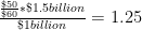
So after correcting for the price increase, the actual increase in the amount of shoes produced is 25 percent. Although the example is a tremendous simplification, it is in essence how growth in output is measured by national statistical agencies.

In order for this method to work, you obviously need good data on changes in price. Governments traditionally get this information with what's called a "matched model" method. Basically, they try to match up two identical goods at two different points in time, and see how their prices change. In principle, this makes sense. In practice, however, there is an obvious problem: what if you can't find a perfect match from one time period to another? After all, old products are constantly disappearing and being replaced by new ones--think of the transition from videotapes to DVDs to Blu-Ray discs, for example. This has always been a concern, but the problem has gotten more attention recently because of the increasing economic importance of computers and information technology, which are subject to rapid qualitative change. For example, it's not really possible to come up with a perfect match between what a desktop computer cost ten years ago and what it costs today, because the quality of computers has improved so much. A $1000 desktop from a decade ago would be blown away by the computing power I currently have in my phone. It's not possible to buy a desktop in 2011 that's as weak as the 2000 model, any more than it was possible to buy a 2011-equivalent PC ten years ago.

Experts in national accounts have spent a long time thinking about this problem. The OECD has a very useful handbook by price-index specialist Jack Triplett, which discusses the issues in detail. He discusses both the traditional matched-model methods and the newer "hedonic pricing" methods for dealing with the situation where an old product is replaced by a qualitatively different new one.

Traditional methods of quality adjustment are based on either measuring or estimating the price of the new product and the old one at a single point in time, and using this as the "quality adjustment". So, for example, if a new computer comes out that costs $1000, and it temporarily exists in the market alongside another model that costs $800, then the new computer is assumed to be 20 percent "better" than the old one, and this adjustment is incorporated into the price adjustment. The intuition here is that the higher price of the new model is not due to inflation, as would be assumed in the basic matched-model framework, but reflects an increase in quality and therefore an increase in real output.

Adapting the previous example, suppose revenues from selling computers rise from $1 billion to $1.5 billion dollars between periods 1 and 2, and assume for simplicity that there is just one computer model, which is replaced by a better model between the two periods. Suppose that, as in the example just given, the new model is priced at $1000 when introduced at time 1, compared to 800 for the old model. Then at time 2, the old model has disappeared, while the new model has risen in price to $1200. As before, nominal growth is 50 percent. With no quality adjustment, the real growth in output is:

\frac{\frac{\$1000}{\$1200}*\$1.5 billion}{\$1 billion} = 1.25

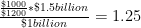
Or 25 percent growth. If we add a quality adjustment reflecting the fact that the new model is 20 percent "better", however, we get:

\frac{\frac{\$1000}{\$800} * \frac{\$1000}{\$1200} * \$1.5 billion}{\$1 billion} = 1.56

Meaning that real output has increased by 56 percent, or more than the nominal amount of revenue growth, even adjusting for inflation.

In practice, it's often impossible to measure the prices of old and new models at the same time. There are a number of methods for dealing with this, all of which amount to some kind of imputation of what the relative prices of the two models would have been, had they been observed at the same time. In addition, there are a number of other complexities that can enter into quality adjustments, having to do with changes in package size, options being made standard, etc. For the most part, the details of these aren't important. One special kind of adjustment that is worth noting is the "production cost" adjustment, which is quite old and has been used to measure, for example, model changes in cars. In this method, you survey manufacturers and ask them: what would it have cost you to build your new, higher-quality model in an early period? So for a computer, you would ask: how much would it have cost you to produce a computer as powerful as this year's model, if you had done it last year? However, Triplett notes that in reality, this method tends not to be practical for fast-changing technologies like computers.

Although they are intuitively appealing, it turns out that the traditional methods of quality adjustment have many potential biases. Some of them are related to the difficulty of estimating the "overlapping" price of two different models that never actually overlapped in the market. But even when such overlapping prices are available, there are potential problems: older models may disappear because they did not provide good quality for the price (meaning that the overlapping model strategy overestimates the value of the older model), or the older model may have been temporarily put on sale when the new model was introduced, among other issues.

The problems with traditional quality adjustments gave rise to an alternative method of "hedonic" price indexes. Where the traditional method simply compares a product with an older version of the same product, hedonic indices use a model called a "hedonic function" to predict a product's price based on its characteristics. Triplett gives the example of a study of mainframe computers from the late 1980's, in which a computer's price was modeled as a function of its processor speed, RAM, and other technical characteristics.

The obvious advantage of the hedonic model is that it allows you to say precisely what it is about a new product that makes it superior to an old one. The hedonic model can either be used as a supplement to traditional method, as a way of dealing with changes in products, or it can entirely replace the old methods based on doing one-to-one price comparisons from one time period two another.

The important thing to understand about all of these quality-adjustment methodologies is what they imply about output numbers: growth in the output of the economy can be due to making more widgets, or to making the same number of widgets but making them better. In practice, of course, both types of growth are occuring at the same time. As this discussion shows, quality adjustments are both unavoidable and highly controversial, and they introduce an unavoidable subjective element into the definition of economic output. This has to be kept in mind when using any time series of output over time, since these numbers will reflect the methdological choices of the agencies that collected the data.

Despite these caveats, however, wading into this swamp of technical debates has convinced me that the existing output and value-added numbers are at least a decent approximation of the actual productivity of the economy, and are therefore suitable for making my larger point about manufacturing: the decline of manufacturing employment is less a consequence of globalization than it is a result of technological improvements and increasing labor productivity.

The Abuse of Statistical Significance: A Case Study

April 18th, 2010  |  Published in Social Science, Statistics

For years now--decades, in fact--statisticians and social scientists have been complaining about the practice of testing for the presence of some relationship in data by running a regression and then looking to see whether some coefficient is statistically significant at some arbitrary confidence level (say, 95 percent.) And while I completely endorse these complaints, they can often seem rather abstract. Sure, you might say, the significance level is arbitrary, and you can always find a statistically significant effect with a big enough sample size, and statistical significance isn't the same as substantive importance. But as long as you're sensitive to these limitations, surely it can't hurt to use statistical significance as a quick way of checking whether you need to pay attentio to a relationship between variables, or whether it can be safely ignored?

As it turns out, a reliance on statistical significance can lead you to a conclusion that is not just imprecise or misleading, but is in fact the exact opposite of the correct answer. Until now, I've never found a really simple, clear example of this, although the stuff discussed in Andrew Gelman's "The Difference Between 'Significant' and 'Not Significant' Is Not Statistically Significant" is a good start. But now along comes Phil Birnbaum with a report of a really amazing howler of a bad result, driven entirely by misuse of statistical significance. This is going to become my go-to example of significance testing gone horribly wrong.

Birnbaum links to this article, which used a study of cricket players to argue that luck plays a big role in how people fare in the labor market. The basic argument is that cricket players do better at home than on the road, but that teams don't take this into account when deciding what players to keep for their team. The result is that some players are more likely to be dropped just because they had the bad luck to make their debut on the road.

Now, I happen to be inclined a priori to agree with this argument, at least for labor markets in general if not cricket (which I don't know anything about). And perhaps because the argument is intuitively compelling, the paper was discussed on the New York Times Freakonomics blog and on Matt Yglesias's blog. But the analysis that the authors use to make their case is entirely bogus.

Birnbaum goes into it in excellent detail, but the gist of it is as follows. They estimate a regression of the form:

In this model, Avg is your average as a cricket bowler, and HomeDebut is 1 if you debut at home, 0 if you debut on the road.  We expect coefficient B to be negative--if your average is lower, you have a better chance of being dropped. But if teams are taking the home field advantage into account, coefficients C and D should be positive, indicating that teams will value the same average more if it was achieved on the road rather than at home.

And what did the authors find? C and D were indeed positive. This would suggest that teams do indeed discount high averages that were achieved at home relative to those achieved on the road. Yet the authors write:

[D]ebut location is superfluous to the retention decision. Information about debut location is individually and jointly insignificant, suggesting that these committees focus singularly on debut performance,  regardless of location. This signal bias suggests that batsmen lucky enough to debut at home are more likely to do well on debut and enjoy greater playing opportunities.

How do they reach this conclusion? By noting that the coefficients for the home-debut variables are not statistically significant. But as Birnbaum points out, the magnitudes and directions of the coefficients are completely consistent with what you might expect to find if there was in fact no home-debut bias in retention decisions. And the regressions are only based on 431 observations, meaning that large standard errors are to be expected. So it's true that the confidence intervals on these coefficients include zero--but that's not the same as saying that zero is the most reasonable estimate of their true value! As the saying goes, absence of evidence is not evidence of absence. As Birnbaum says, all these authors have really shown is that they don't have enough data to properly address their question.

Birnbaum goes into all of this in much more detail. I'll just add one additional thing that makes this case especially egregious. All the regressions use "robust standard errors" to correct for heteroskedasticity. Standard error corrections like these are very popular with economists, but this is a perfect example of why I hate them. For what does the robustness-correction consist of? In general, it makes standard errors larger. This is intended to decrease the probability of a type I error, i.e., finding an effect that is not there. But by the same token, larger standard errors increase type II error, failing to find an effect that is there. And in this case, the authors used the failure to find an effect as a vindication of their argument--so rather than making the analysis more conservative -i.e., more robust to random variation and mistaken assumptions--the "robust" standard errors actually tip the scales in favor of the paper's thesis!

It's entirely possible that the authors of this paper were totally unaware of these problems, and genuinely believed their findings because they had so internalized the ideology of significance-testing. And the bloggers who publicized this study were, unfortunately, engaging in a common vice: promoting a paper whose findings they liked, while assuming that the methodology must be sound because it was done by reputable people (in this case, IMF economists.) But things like this are exactly why so many people--both inside and outside the academy--are instinctively distrustful of quantitative research. And the fact that Phil Birnbaum dug this up exemplifies what I love about amateur baseball statisticians, who tend to be much more flexible and open minded in their approach to quantitative methods. I suspect a lot of trained social scientists would have read over this thing without giving it a second though.

Republican Census Protestors: Myth or Reality?

April 1st, 2010  |  Published in Politics, Statistical Graphics, Statistics

April 1 is "Census Day", the day on which you're supposed to have turned in your response to the 2010 census. Of course, lots of people haven't returned their form, and the Census Bureau even has a map where you can see how the response rates look in different parts of the country.

Lately, there's been a lot of talk about the possibility that conservatives are refusing to fill out the census as a form of protest. This behavior has been encouraged by the anti-census rhetoric of elected officials such as Representatives Michelle Bachman (R-MN) and Ron Paul (R-TX).  In March, the Houston Chronicle website reported that response rates in Texas were down, especially in some highly Republican areas. And conservative Republican Patrick McHenry (R-NC) was so concerned about this possible refusal--which could lead conservative areas to lose federal funding and even congressional representatives--that he went on the right-wing site redstate.com to encourage conservatives to fill out the census.

Thus far, though, we've only heard anecdotal evidence that right-wing census refusal is a real phenomenon. Below I try to apply more data to the question.

The Census Bureau provides response rates by county in a downloadable file on their website.  The data in this post were downloaded on April 1. To get an idea of how conservative a county is, we can use the results of the 2008 Presidential election, and specifically Republican share of the two-party vote--that is, the percentage of people in a county who voted for John McCain, with third-party votes excluded. The results look like this:

It certainly doesn't look like there's any overall trend toward lower participation in highly Republican counties, and indeed the correlation between these two variables is only -0.01. In fact, the highest participation seems to be in counties that are neither highly Democratic nor highly Republican, as shown by the trend line.

So, myth: busted? Not quite. There are some other factors that we should take into account that might hide a pattern of conservative census resistance. Most importantly, many demographic groups that tend to lean Democratic, such as the poor and non-whites, are also less likely to respond to the census. So even if hostility to government were holding down Republican response rates, they still might not appear to be lower than Democratic response rates overall.

Fortunately, the Census Bureau has a measure of how likely people in a given area are to be non-respondents to the census, which they call the "Hard to Count score". This combines information on multiple demographic factors including income, English proficiency, housing status, education, and other factors that may make people hard to contact. My colleagues Steve Romalewski and Dave Burgoon have designed an excellent mapping tool that shows the distribution of these hard-to-count areas around the county, and produced a report on the early trends in census response around the country.

We can test the conservative census resistance hypothesis using a regression model that predicts 2010 census response in a county using the 2008 McCain vote share, the county Hard to Count score, and the response rate to the 2000 census. Including the 2000 rate will help us further isolate any Republican backlash to the census, since it's a phenomenon that has supposedly arisen only within the last few years. Since different counties can have wildly differing population densities, the data is weighted according to population.* The resulting model explains about 70% of the variation in census response across counties, and the equation for predicting the response looks like this:

The coefficient of 0.06 for the Republican vote share variable means that when we control for the 2000 response rate and the county HTC score, Republican areas actually have higher response rates, although the effect is pretty small.  If two counties have identical HTC scores and 2000 response rates but one of them had a 10% higher McCain vote in 2008, we would expect the more Republican county to have a 0.6% higher census 2010 response rate. **

Now, recall that the original news article that started this discussion was about Texas. Maybe Texas is different? We can test that by fitting a multi-level model in which we allow the effect of Republican vote share on census response to vary between states. The result is that rather than a single coefficient for the Republican vote share (the 0.06 in the model above), we get 50 different coefficients:

Or, if you prefer to see your inferences in map form:

The reddish states are places where having more Republicans in a county is associated with a lower response rate to the census, and blue states are places where more Republican counties are associated with higher response rates.

We see that there are a few states where Republicans seem to have lower response rates than Democratic ones, such as South Carolina and Nebraska. Even here, though, the confidence intervals are crossing zero or close to it. And Texas doesn't look particularly special, the more Republican areas there seem to have better response rates (when controlling for the other variables), just like most other places.

So given all that, how can we explain the accounts of low response rates in Republican areas? The original Houston Chronicle news article says that:

In Texas, some of the counties with the lowest census return rates are among the state's most Republican, including Briscoe County in the Panhandle, 8 percent; King County, near Lubbock, 5 percent; Culberson County, near El Paso, 11 percent; and Newton County, in deep East Texas, 18 percent.

OK, so let's look at those counties in particular. Here's a comparison of the response rate to the 2000 census, the response this year, and the response that would be predicted by the model above. (These response rates are higher than the ones quoted in the article, because they are measured at a later date.)

Population Response,

2000

Response,

2010

Predicted

Response

Error Republican

vote, 2008

King County, TX 287 48% 31% 43% 12% 95%
Briscoe County, TX 1598 61% 41% 51% 10% 75%
Culberson County, TX 2525 38% 34%
Newton County, TX 14090 51% 34% 43% 9% 66%

The first thing I notice is that the Chronicle was fudging a bit when it called these "among the state's most Republican" counties. Culberson county doesn't look very Republican at all! The others, however, fit the bill. And for all three, the model does substantially over-predict census response.  (Culberson county has no data for the 2000 response rate, so we can't get a prediction there.) What's going on here? It looks like maybe there's something going on in these counties that our model didn't capture.

To understand what's going on, let's take a look at the ten counties where the model made the biggest over-predictions of census response:

Population Response,

2000

Response,

2010

Predicted

Response

Error Republican

vote, 2008

Duchesne County, UT 15701 41% 0% 39% 39% 84%
Forest County, PA 6506 68% 21% 57% 36% 57%
Alpine County, CA 1180 67% 17% 49% 32% 37%
Catron County, NM 3476 47% 17% 39% 22% 68%
St. Bernard Parish, LA 15514 68% 37% 56% 19% 73%
Sullivan County, PA 6277 63% 35% 53% 18% 60%
Lake of the Woods County, MN 4327 46% 27% 45% 18% 57%
Cape May County, NJ 97724 65% 36% 54% 18% 54%
Edwards County, TX 1935 45% 22% 39% 17% 66%
La Salle County, TX 5969 57% 26% 43% 17% 40%%

I have a hard time believing that the response rate in Duchesne county, Utah is really 0%, so that's probably some kind of error. But as for the rest, most of these counties are heavily Republican too, which suggests that maybe there is some phenomenon going on here that we just aren't capturing. But now look at the counties where the model made the biggest under-prediction--where it thought response rates would be much lower than they actually were:

Population Response,

2000

Response,

2010

Predicted

Response

Error Republican

vote, 2008

Oscoda County, MI 9140 37% 66% 36% -30% 55%
Nye County, NV 42693 13% 47% 22% -25% 57%
Baylor County, TX 3805 51% 66% 45% -21% 78%
Clare County, MI 31307 47% 62% 42% -20% 48%
Edmonson County, KY 12054 55% 65% 46% -19% 68%
Hart County, KY 18547 62% 68% 49% -19% 66%
Dare County, NC 33935 35% 57% 39% -18% 55%
Lewis County, KY 14012 61% 66% 48% -18% 68%
Gilmer County, WV 6965 59% 63% 45% -18% 59%
Crawford County, IN 11137 62% 68% 51% -17% 51%

Most of these are Republican areas too!

So what's going on? It's hard to say, but my best guess is that part of it has to do with the fact that most of these are fairly low-population counties. With a smaller population, these places are going to show more random variability in their average response rates than the really big counties. Smaller counties tend to be rural counties, and rural areas tend to be more conservative. Thus, it's not surprising that the places with the most surprising shortfalls in census response are heavily Republican--and that the places with the most surprising high response rates are heavily Republican too.

At this point, I have to conclude that there really isn't any firm evidence of Republican census resistance. That's not to say it doesn't exist. I'm sure it does, even if it's not on a large enough scale to be noticeable in the statistics.  It's also possible that the Republican voting variable I used isn't precise enough--the sort of people who are most receptive to anti-census arguments are probably a particular slice of far-right Republican. And it's always difficult to make any firm conclusions about the behavior of individuals based on aggregates like county-level averages, without slipping into the ecological fallacy. Nonetheless, these results do suggest the strong possibility that the media have been led astray by a plausible narrative and a few cherry-picked pieces of data.

* Using unweighted models doesn't change the main conclusions, although it does bring some of the Republican vote share coefficients closer to zero--meaning that it's harder to conclude that there is any relationship between Republican voting and census response, either positive or negative.

** All of these coefficients are statistically significant at a 95% confidence level.

Making things, marking time

January 27th, 2010  |  Published in Data, Political Economy, R, Work

Today Matt Yglesias revisits a favorite topic of mine, the distinction between U.S. manufacturing employment and manufacturing production. It has become increasingly common to hear liberals complain about the "decline" in American manufacturing, and lament that America doesn't "make things" anymore:

Harold Meyerson had a typical riff on this recently:

Reviving American manufacturing may be an economic and strategic necessity, without which our trade deficit will continue to climb, our credit-based economy will produce and consume even more debt, and our already-rickety ladders of economic mobility, up which generations of immigrants have climbed, may splinter altogether.

. . .

The epochal shift that's overtaken the American economy over the past 30 years  . . .  finance, which has compelled manufacturers to move offshore in search of higher profit margins . . .  retailers, who have compelled manufacturers to move offshore in search of lower prices for consumers and higher profits for themselves

. . .

Creating the better paid, less debt-ridden work force that would emerge from a shift to an economy with more manufacturing and a higher rate of unionization would reduce the huge revenue streams flowing to the Bentonvilles (Wal-Mart's home town) and the banks . . . . The campaign contributions from the financial sector to Democrats and Republicans alike now dwarf those from manufacturing -- a major reason why our government's adherence to free-trade orthodoxy in what is otherwise a mercantilist world is likely to persist.

. . .

[Sen. Sherrod] Brown . . . acknowledges that as manufacturing employs a steadily smaller share of the American work force, "younger people probably don't think about it as much" as their elders . . . . Politically, American manufacturing is in a race against time: As manufacturing becomes more alien to a growing number of Americans, its support may dwindle, even as the social, economic, and strategic need to bolster it becomes more acute. That makes push for a national industrial policy -- to become again a nation that makes things instead of debt, to build again our house upon a rock -- even more urgent.

I don't dispute that manufacturing has become "more alien" to the bulk of American working people. But I question Meyerson's explanation for why this has happened, and I wonder whether we should really be so horrified by it. The evidence suggests that the decline in manufacturing employment in this country has been driven not primarily by offshoring (as Meyerson would have it), but by a dramatic increase in productivity. Yglesias provides one graphical illustration of this; here is my home-brewed alternative, going back to World War II:

Manufacturing output and employment, 1939-2009

This picture leaves some unanswered questions, to be sure. First, one would want to know what kind of manufacturing has grown in the U.S., for one thing; however, my cursory examination of the data suggests that U.S. output is still more heavily oriented toward consumer goods over defense and aerospace production, despite what one might think. Second, it's possible that the globally integrated system of production is "hiding" labor in other parts of the supply chain, in China and other countries with low labor costs.

But I don't think the general story of rapidly increasing productivity can be easily ignored. To really reverse the decline in manufacturing employment, we would need to have something like a ban on labor-saving technologies, in order to return the U.S. economy to the low-productivity equilibrium of forty or fifty years ago. Of course, that would also require either reducing American wages to Chinese levels or imposing a level of autarchy in trade policy beyond what any left-protectionist advocates.

Needless to say, I think this modest proposal is totally undesirable, and I raise it only to suggest the folly of "rebuilding manufacturing" as a slogan for the left. As Yglesias observes in the linked post, manufacturing now seems to be going through a transition like the one that agriculture experienced in the last century: farming went from being the major activity of most people to being a niche of the economy that employs very few people. Yet of course food hasn't ceased to be one of the fundamental necessities of human life, and we produce more of it than ever.

And yet I understand the real problem that motivates the pro-manufacturing instinct among liberals. The decline in manufacturing has coincided with a massive increase in income inequality and a decline in the prospects for low-skill workers. Moreover, the decline of manufacturing has coincided with the decline of organized labor, and it is unclear whether traditional workplace-based labor union organizing can ever really succeed in a post-industrial economy.  But the nostalgia for a manufacturing-centered economy is an attempt to universalize a very specific period in the history of capitalism, one which is unlikely to recur.

The obsession with manufacturing jobs is, I think, a symptom of a larger weakness of liberal thought: the preoccupation with a certain kind of full-employment Keynesianism, predicated on the assumption that a good society is one in which everyone is engaged in full-time waged employment. But this sells short the real potential of higher productivity: less work for all. As Keynes himself observed:

For the moment the very rapidity of these changes is hurting us and bringing difficult problems to solve. Those countries are suffering relatively which are not in the vanguard of progress. We are being afflicted with a new disease of which some readers may not yet have heard the name, but of which they will hear a great deal in the years to come-‑namely, technological unemployment. This means unemployment due to our discovery of means of economising the use of labour outrunning the pace at which we can find new uses for labour.

But this is only a temporary phase of maladjustment. All this means in the long run that mankind is solving its economic problem. I would predict that the standard of life in progressive countries one hundred years hence will be between four and eight times as high as it is to‑day. There would be nothing surprising in this even in the light of our present knowledge. It would not be foolish to contemplate the possibility of afar greater progress still.

. . .

Thus for the first time since his creation man will be faced with his real, his permanent prob­lem‑how to use his freedom from pressing economic cares, how to occupy the leisure, which science and compound interest will have won for him, to live wisely and agreeably and well.

Productivity has continued to increase, just as Keynes predicted. Yet the long weekend of permanent leisure never arrives. This--and not deindustrialization--is the cruel joke played on working class. The answer is not to force people into deadening make-work jobs, but rather to acknowledge our tremendous social wealth and ensure that those who do not have access to paid work still have access to at least the basic necessities of life--through something like a guaranteed minimum income.


Geeky addendum: I thought the plot I made for this post was kind of nice and it took some figuring out to make it, so below is the R code required to reproduce it. It queries the data sources (A couple of Federal Reserve sites) directly, so no saving of files is required, and it should automatically use the most recent available data.

manemp <- read.table("http://research.stlouisfed.org/fred2/data/MANEMP.txt",
   skip=19,header=TRUE)
names(manemp) <- tolower(names(manemp))
manemp$date <- as.Date(manemp$date, format="%Y-%m-%d")
 
curdate <- format(as.Date(substr(as.character(Sys.time()),1,10)),"%m/%d/%Y")
 
outputurl <- url(paste(
   'http://www.federalreserve.gov/datadownload/Output.aspx?rel=G17&amp;series=063c8e96205b9dd107f74061a32d9dd9&amp;lastObs=&amp;from=01/01/1939&amp;to=',
   curdate,
   '&amp;filetype=csv&amp;label=omit&amp;layout=seriescolumn',sep=''))
 
manout <- read.csv(outputurl,
   as.is=TRUE,skip=1,col.names=c("date","value"))
manout$date <- as.Date(paste(manout$date,"01",sep="-"), format="%Y-%m-%d") par(mar=c(2,2,2,2)) plot(manemp$date[manemp$date&gt;="1939-01-01"],
   manemp$value[manemp$date&gt;="1939-01-01"],
type="l", col="blue", lwd=2,
xlab="",ylab="",axes=FALSE, xaxs="i")
axis(side=1,
   at=as.Date(paste(seq(1940,2015,10),"01","01",sep="-")),
   labels=seq(1940,2015,10))
text(as.Date("1955-01-01"),17500,
   "Manufacturing employment (millions)",col="blue")
axis(side=2,col="blue")
 
par(new=TRUE)
plot(manout$date,manout$value,
   type="l", col="red",axes=FALSE,xlab="",ylab="",lwd=2,xaxs="i")
text(as.Date("1975-01-01"),20,
   "Manfacturing output (% of output in 2002)", col="red")
axis(side=4,col="red")

Elster on the Social Sciences

October 20th, 2009  |  Published in Social Science, Sociology, Statistics

The present crisis looks as though it may bring about a long-delayed moment of reckoning in the field of economics. Macro-economics has been plunged into turmoil now that many of its leading practitioners stand exposed as dogmatists blithely clinging to absurd pre-Keynesian notions about the impossibility of economic stimulus and the inherent rationality of markets, who have nothing at all to say about the roots of the current turmoil. Micro-economics, meanwhile, has seen Freakonomics run its course, as long-standing criticisms of the obsession with "clean identification" over meaningful questions spill over into a new row over climate-change denialism.

Joining the pile-on, Jon Elster has an article in the electronic journal Capitalism and Society on the "excessive ambitions" of the social sciences. Focusing on economics--but referring to related fields--he criticizes three main lines of inquiry: rational choice theory, behavioral economics, and statistical inference.

Although I agree with most of the article's arguments, much of it seemed rather under-argued. At various points, Elster's argument seems to be: "I don't need to provide an example of this; isn't it obvious?" And with respect to his claim that "much work in economics and political science is devoid of empirical, aesthetic, or mathematical interest, which means that it has no value at all", I'm inclined to agree. But it's hard for me to say that Elster is contributing a whole lot to the discussion. I'm also a bit skeptical of the claim that behavioral economics has "predictive but not prescriptive implications", given the efforts of people like Cass Sunstein to implement "libertarian paternalist" policies based on an understanding of some of the irrationalities studied in behavioral research.

But the part of the essay closest to my own interests was on data analysis. Here Elster is wading into the well-travelled terrain of complaining about poorly reasoned statistical analysis. He himself admits to being inexpert in these matters, and so relies on others, especially David Freedman. But he still sees fit to proclaim that we are awash in work that is both methodogically suspect and insufficiently engaged with its empirical substance.

The criticisms raised are all familiar. The specter of "data snooping . . . curve-fitting . . . arbitrariness in the measurement of . . . variables", and so on, all fit under the rubric of what Freedman called "data driven model selection". And indeed these things are all problems. But much of Elster's discussion suffers from his lack of familiarity with the debates. He refers repeatedly to the problem of statistical significance testing--both the confusion of statistical and substantive significance, and the arbitrariness of the traditional 5% threshold for detecting effects. While I wouldn't deny that these abuses persist, I think that years of relentless polemics on this issue from people like Deirdre McCloskey and Jacob Cohen have had an impact, and practice has begun to shift in a more productive direction.

Elster never really moves beyond these technical details to grapple with the larger philosphical issues that arise in applied statistics. For example, all of the problems with statistical significance arise from an over-reliance on the null hypothesis testing model of inference--even though as Andrew Gelman says, the true value of a parameter is never zero in any real social science situation. Simply by moving in the direction of estimating the magnitude of effects and their confidence intervals, we can avoid many of these problems.

And although Freedman makes a number of very important criticisms of standard practice, the article that Elster relies upon relies very heavily on the weakness of the causal claims made about regression models. As a superior model, Freedman invokes John Snow's analysis of cholera in the 1850's, which used simple methods but relied upon identifying a natural experiment in which different houses received their water from different sources. In this respect, the article is redolent of the time it was published (1991), when the obsession with clean identification and natural experiments was still gaining steam, and valid causal inference seemed like the most important goal of social science.

Yet we now see the limitations of that research agenda. It's rare and fortuitous to find a situation like Snow's cholera study, in which a vitally important question is illuminated by a clean natural experiment. All too often, the search for identification leads researchers to study obscure topics of little general relevance, thereby gaining internal validity (verifiable causality in a given data set) at the expense external validity (applicability to broader social situations). This is what has led to the stagnation of Freakonomics-style research. What we have to accept, I think, is that it is often impossible to find an analytical strategy which is both free of strong assumptions about causality and applicable beyond a narrow and artificial situation. The goal of causal inference, that is, is a noble but often futile pursuit. In place of causal inference, what we must often do instead is causal interpretation, in which essentially descriptive tools (such as regression) are interpreted causally based on prior knowledge, logical argument and empirical tests that persuasively refute alternative explanations.**

This is, I think, consistent with the role Elster proposes for data analysis, in the closing of his essay: an enterprize which "turns on substantive causal knowledge of the field in question together with the imagination to concoct testable implications that can establish 'novel facts'". And Elster gives some useful practical suggestions for improving results, such as partitioning data sets, fitting models on only one half, and not looking at the other half of the cases until a model is decided upon. But as with many rants against statistical malpractice, it seems to me that the real sociological issue is being sidestepped, which is that the institutional structure of social science strongly incentivizes malpractice. To put it another way, the purpose of academic social science is not, in general, to produce valid inference about the world; it is to produce publications. As long as that is the case, it seems unlikely that bad practices can be definitively stamped out.

**Addendum: Fabio Rojas says what I wanted to say, rather more concisely. He notes that "identification is a luxury when you have an abundance of data and a pretty clear idea about what casual effects you care about.". Causal inference where possible, causal interpretation where necessary, ought to be the guiding principle. Via the Social Science Statistics blog, there is also a very interesting paper by Angus Deaton on the problems of causal inference. Of particular note is the difficulty of testing the assumptions behind instrumental variables methods, and the often-elided distinction between an instrument that is external to the process under investigation (that is, not caused by the system being studied) and one that is truly exogenous (that is, uncorrelated with the error term in the regression of the outcome on the predictor of interest.)

The data seem so much less real once you ask the same person the same question twice

October 12th, 2009  |  Published in Data, Social Science, Statistics

I identify with Jeremy Freese to an unhealthy degree. When the other options are to a) have a life; or b) do something that advances his career, he chooses to concoct a home-brewed match between GSS respondents in 2006 and their 2008 re-interviews. I would totally do this. I still might do this.

And then he drops the brutal insight that provides my title. Context.

UPDATE: And then Kieran Healy drops this:

The real distinction between qualitative and quantitative is not widely appreciated. People think it has something to do with counting versus not counting, but this is a mistake. If the interpretive work necessary to make sense of things is immediately obvious to everyone, it’s qualitative data. If the interpretative work you need to do is immediately obvious only to experts, it’s quantitative data.