Not a riot, it’s a rebellion
August 14th, 2014 | Published in Data, Politics
[Context](http://rap.genius.com/The-coup-the-coup-lyrics).
Solidarity to the people of Ferguson, Missouri, and a hearty fuck you to the cops, their bosses, and to anyone who wants to blather about "rioters" and otherwise engage in bogus "both sides" [equivalency](http://www.businessinsider.com/here-comes-obamas-statement-on-ferguson-2014-8) instead of keeping the focus on the extrajudicial executions of these state-sanctioned death squads. See also Robert Stephens II for an excellent [analysis](https://www.jacobinmag.com/2014/08/in-defense-of-the-ferguson-riots/) of the actions of the people in Ferguson as part of a process of political mobilization rather than simply undirected vandalism.
What is happening in Missouri is horrifying, yet unusual only in the attention it's receiving. I hope it at least wakes people up to the nature of our heavily militarized police forces---Ferguson is in no way unusual. The other day I sent my editors a draft manuscript for the longer-form adaptation of [Four Futures](https://www.jacobinmag.com/2011/12/four-futures/). In discussing the fourth of those futures, Exterminism, I describe the widespread militarization of the police in the United States, which has its roots in the 1960's but has intensified in the post-9/11 period.
This is a literal case of "bringing the war home." Many of the tanks and other equipment that can be found even in small towns are surplus military equipment, given away to police departments when no longer needed in Iraq or Afghanistan. And of course many cops are veterans, who had a chance to learn from the American government's callous approach to civilian life abroad. I struggled to finish that chapter, because it seemed every day brought a new and more horrifying example of what I was writing about.
It all leads here:
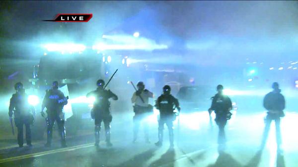
This isn't a movie scene #reality RT @FOX2now: Officers stand in a mist of tear gas. Protected by masks. #Ferguson pic.twitter.com/afsqru8rwg
— Trinna Leong (@trinnaleong) August 12, 2014
But I'm only repeating what many are now saying. As some kind of substantive contribution, I figured I'd refute a specific canard that arises from defenders of the [warrior cops](http://www.amazon.com/Rise-Warrior-Cop-Militarization-Americas/dp/1610392116) in situations like this. That is, that all of these trappings of military occupation are necessary because of the oh so dangerous environment the police supposedly face.
Policing is not the country's safest job, to be sure. But as the Bureau of Labor Statistics' [Census of Fatal Occupational Injuries](http://www.bls.gov/iif/oshwc/cfoi/cfoi_rates_2012hb.pdf) shows, it's far from the most dangerous. The 2012 data reports that for "police and sheriff's patrol officers," the Fatal Injury Rate---that is, the "number of fatal occupational injuries per 100,000 full-time equivalent workers"---was 15.0. And that includes all causes of death---of the 105 dead officers recorded in the 2012 data, only 51 [died](http://www.bls.gov/iif/oshwc/cfoi/cftb0272.pdf) due to "violence and other injuries by persons or animals." Nearly as many, 48, died in "transportation incidents," e.g., crashing their cars.
Here are some occupations with higher fatality rates than being a cop:
* Logging workers: 129.9
* Fishers and related fishing workers: 120.8
* Aircraft pilots and flight engineers: 54.3
* Roofers: 42.2
* Structural iron and steel workers: 37.0
* Refuse and recyclable material collectors: 32.3
* Drivers/sales workers and truck drivers: 24.3
* Electrical power-line installers and repairers: 23.9
* Farmers, ranchers and other agricultural managers: 22.8
* Construction laborers: 17.8
* Taxi drivers and chauffeurs: 16.2
* Maintenance and repairs workers, general: 15.7
Of these, construction labor is the one I've done myself. [This](http://www.bgdlegal.com/clientuploads/Publications/Blog%20and%20Article%20Photos/Construction%20Helmet.png) was what our required body armor looked like.
And for good measure, some more that approach the allegedly terrifying risks of being a cop:
* First-line supervisors of landscaping, lawn service, and groundskeeping workers: 14.7
* Grounds maintenance workers: 14.2
* Athletes, coaches, umpires, and related workers: 13.0
While being a cop might not be all that dangerous, being in the presence of cops certainly is. In 2012, there were a minimum of [410 people](http://www.fbi.gov/about-us/cjis/ucr/crime-in-the-u.s/2012/crime-in-the-u.s.-2012/offenses-known-to-law-enforcement/expanded-homicide/expanded_homicide_data_table_14_justifiable_homicide_by_weapon_law_enforcement_2008-2012.xls) killed by police, and that includes only those reported to the FBI under the creepy category of "justifiable homicide." The [real number](http://www.thedenverchannel.com/news/teens-shooting-highlights-need-for-tracking-people-killed-by-police) is probably closer to 1000.
Of course, nobody who knows anything about what police actually do, and isn't pushing a reactionary political agenda, thinks cops actually need to be dressed in heavier armor than the [occupiers of Iraq and Afghanistan](https://storify.com/AthertonKD/veterans-on-ferguson). And the fact that you have a better than 1-in-1000 chance of dying in any given year in certain jobs it itself scandalous. But perhaps looking at these numbers helps put the real nature of American policing in a somewhat different perspective.