Archive for April, 2010

The Abuse of Statistical Significance: A Case Study

April 18th, 2010  |  Published in Social Science, Statistics

For years now--decades, in fact--statisticians and social scientists have been complaining about the practice of testing for the presence of some relationship in data by running a regression and then looking to see whether some coefficient is statistically significant at some arbitrary confidence level (say, 95 percent.) And while I completely endorse these complaints, they can often seem rather abstract. Sure, you might say, the significance level is arbitrary, and you can always find a statistically significant effect with a big enough sample size, and statistical significance isn't the same as substantive importance. But as long as you're sensitive to these limitations, surely it can't hurt to use statistical significance as a quick way of checking whether you need to pay attentio to a relationship between variables, or whether it can be safely ignored?

As it turns out, a reliance on statistical significance can lead you to a conclusion that is not just imprecise or misleading, but is in fact the exact opposite of the correct answer. Until now, I've never found a really simple, clear example of this, although the stuff discussed in Andrew Gelman's "The Difference Between 'Significant' and 'Not Significant' Is Not Statistically Significant" is a good start. But now along comes Phil Birnbaum with a report of a really amazing howler of a bad result, driven entirely by misuse of statistical significance. This is going to become my go-to example of significance testing gone horribly wrong.

Birnbaum links to this article, which used a study of cricket players to argue that luck plays a big role in how people fare in the labor market. The basic argument is that cricket players do better at home than on the road, but that teams don't take this into account when deciding what players to keep for their team. The result is that some players are more likely to be dropped just because they had the bad luck to make their debut on the road.

Now, I happen to be inclined a priori to agree with this argument, at least for labor markets in general if not cricket (which I don't know anything about). And perhaps because the argument is intuitively compelling, the paper was discussed on the New York Times Freakonomics blog and on Matt Yglesias's blog. But the analysis that the authors use to make their case is entirely bogus.

Birnbaum goes into it in excellent detail, but the gist of it is as follows. They estimate a regression of the form:

In this model, Avg is your average as a cricket bowler, and HomeDebut is 1 if you debut at home, 0 if you debut on the road.  We expect coefficient B to be negative--if your average is lower, you have a better chance of being dropped. But if teams are taking the home field advantage into account, coefficients C and D should be positive, indicating that teams will value the same average more if it was achieved on the road rather than at home.

And what did the authors find? C and D were indeed positive. This would suggest that teams do indeed discount high averages that were achieved at home relative to those achieved on the road. Yet the authors write:

[D]ebut location is superfluous to the retention decision. Information about debut location is individually and jointly insignificant, suggesting that these committees focus singularly on debut performance,  regardless of location. This signal bias suggests that batsmen lucky enough to debut at home are more likely to do well on debut and enjoy greater playing opportunities.

How do they reach this conclusion? By noting that the coefficients for the home-debut variables are not statistically significant. But as Birnbaum points out, the magnitudes and directions of the coefficients are completely consistent with what you might expect to find if there was in fact no home-debut bias in retention decisions. And the regressions are only based on 431 observations, meaning that large standard errors are to be expected. So it's true that the confidence intervals on these coefficients include zero--but that's not the same as saying that zero is the most reasonable estimate of their true value! As the saying goes, absence of evidence is not evidence of absence. As Birnbaum says, all these authors have really shown is that they don't have enough data to properly address their question.

Birnbaum goes into all of this in much more detail. I'll just add one additional thing that makes this case especially egregious. All the regressions use "robust standard errors" to correct for heteroskedasticity. Standard error corrections like these are very popular with economists, but this is a perfect example of why I hate them. For what does the robustness-correction consist of? In general, it makes standard errors larger. This is intended to decrease the probability of a type I error, i.e., finding an effect that is not there. But by the same token, larger standard errors increase type II error, failing to find an effect that is there. And in this case, the authors used the failure to find an effect as a vindication of their argument--so rather than making the analysis more conservative -i.e., more robust to random variation and mistaken assumptions--the "robust" standard errors actually tip the scales in favor of the paper's thesis!

It's entirely possible that the authors of this paper were totally unaware of these problems, and genuinely believed their findings because they had so internalized the ideology of significance-testing. And the bloggers who publicized this study were, unfortunately, engaging in a common vice: promoting a paper whose findings they liked, while assuming that the methodology must be sound because it was done by reputable people (in this case, IMF economists.) But things like this are exactly why so many people--both inside and outside the academy--are instinctively distrustful of quantitative research. And the fact that Phil Birnbaum dug this up exemplifies what I love about amateur baseball statisticians, who tend to be much more flexible and open minded in their approach to quantitative methods. I suspect a lot of trained social scientists would have read over this thing without giving it a second though.
Republican Census Protestors: Myth or Reality?

April 1st, 2010  |  Published in Politics, Statistical Graphics, Statistics

April 1 is "Census Day", the day on which you're supposed to have turned in your response to the 2010 census. Of course, lots of people haven't returned their form, and the Census Bureau even has a map where you can see how the response rates look in different parts of the country.

Lately, there's been a lot of talk about the possibility that conservatives are refusing to fill out the census as a form of protest. This behavior has been encouraged by the anti-census rhetoric of elected officials such as Representatives Michelle Bachman (R-MN) and Ron Paul (R-TX).  In March, the Houston Chronicle website reported that response rates in Texas were down, especially in some highly Republican areas. And conservative Republican Patrick McHenry (R-NC) was so concerned about this possible refusal--which could lead conservative areas to lose federal funding and even congressional representatives--that he went on the right-wing site redstate.com to encourage conservatives to fill out the census.

Thus far, though, we've only heard anecdotal evidence that right-wing census refusal is a real phenomenon. Below I try to apply more data to the question.

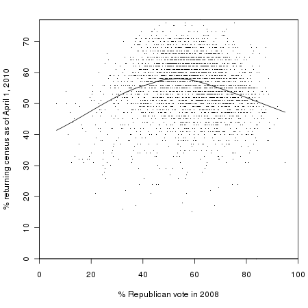
The Census Bureau provides response rates by county in a downloadable file on their website.  The data in this post were downloaded on April 1. To get an idea of how conservative a county is, we can use the results of the 2008 Presidential election, and specifically Republican share of the two-party vote--that is, the percentage of people in a county who voted for John McCain, with third-party votes excluded. The results look like this:

It certainly doesn't look like there's any overall trend toward lower participation in highly Republican counties, and indeed the correlation between these two variables is only -0.01. In fact, the highest participation seems to be in counties that are neither highly Democratic nor highly Republican, as shown by the trend line.

So, myth: busted? Not quite. There are some other factors that we should take into account that might hide a pattern of conservative census resistance. Most importantly, many demographic groups that tend to lean Democratic, such as the poor and non-whites, are also less likely to respond to the census. So even if hostility to government were holding down Republican response rates, they still might not appear to be lower than Democratic response rates overall.

Fortunately, the Census Bureau has a measure of how likely people in a given area are to be non-respondents to the census, which they call the "Hard to Count score". This combines information on multiple demographic factors including income, English proficiency, housing status, education, and other factors that may make people hard to contact. My colleagues Steve Romalewski and Dave Burgoon have designed an excellent mapping tool that shows the distribution of these hard-to-count areas around the county, and produced a report on the early trends in census response around the country.

We can test the conservative census resistance hypothesis using a regression model that predicts 2010 census response in a county using the 2008 McCain vote share, the county Hard to Count score, and the response rate to the 2000 census. Including the 2000 rate will help us further isolate any Republican backlash to the census, since it's a phenomenon that has supposedly arisen only within the last few years. Since different counties can have wildly differing population densities, the data is weighted according to population.* The resulting model explains about 70% of the variation in census response across counties, and the equation for predicting the response looks like this:

The coefficient of 0.06 for the Republican vote share variable means that when we control for the 2000 response rate and the county HTC score, Republican areas actually have higher response rates, although the effect is pretty small.  If two counties have identical HTC scores and 2000 response rates but one of them had a 10% higher McCain vote in 2008, we would expect the more Republican county to have a 0.6% higher census 2010 response rate. **

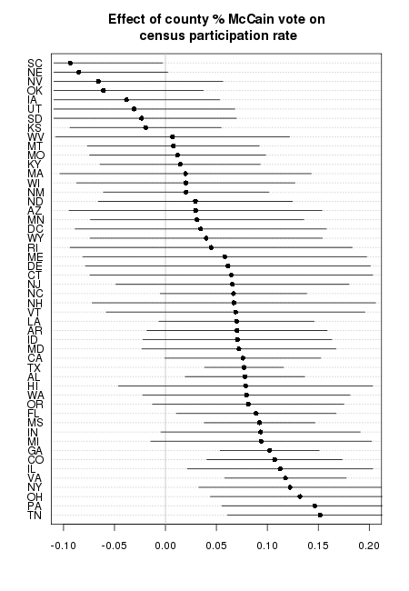
Now, recall that the original news article that started this discussion was about Texas. Maybe Texas is different? We can test that by fitting a multi-level model in which we allow the effect of Republican vote share on census response to vary between states. The result is that rather than a single coefficient for the Republican vote share (the 0.06 in the model above), we get 50 different coefficients:

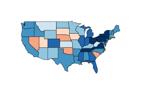
Or, if you prefer to see your inferences in map form:

The reddish states are places where having more Republicans in a county is associated with a lower response rate to the census, and blue states are places where more Republican counties are associated with higher response rates.

We see that there are a few states where Republicans seem to have lower response rates than Democratic ones, such as South Carolina and Nebraska. Even here, though, the confidence intervals are crossing zero or close to it. And Texas doesn't look particularly special, the more Republican areas there seem to have better response rates (when controlling for the other variables), just like most other places.

So given all that, how can we explain the accounts of low response rates in Republican areas? The original Houston Chronicle news article says that:

In Texas, some of the counties with the lowest census return rates are among the state's most Republican, including Briscoe County in the Panhandle, 8 percent; King County, near Lubbock, 5 percent; Culberson County, near El Paso, 11 percent; and Newton County, in deep East Texas, 18 percent.

OK, so let's look at those counties in particular. Here's a comparison of the response rate to the 2000 census, the response this year, and the response that would be predicted by the model above. (These response rates are higher than the ones quoted in the article, because they are measured at a later date.)

Population Response,

2000

Response,

2010

Predicted

Response

Error Republican

vote, 2008

King County, TX 287 48% 31% 43% 12% 95%
Briscoe County, TX 1598 61% 41% 51% 10% 75%
Culberson County, TX 2525 38% 34%
Newton County, TX 14090 51% 34% 43% 9% 66%

The first thing I notice is that the Chronicle was fudging a bit when it called these "among the state's most Republican" counties. Culberson county doesn't look very Republican at all! The others, however, fit the bill. And for all three, the model does substantially over-predict census response.  (Culberson county has no data for the 2000 response rate, so we can't get a prediction there.) What's going on here? It looks like maybe there's something going on in these counties that our model didn't capture.

To understand what's going on, let's take a look at the ten counties where the model made the biggest over-predictions of census response:

Population Response,

2000

Response,

2010

Predicted

Response

Error Republican

vote, 2008

Duchesne County, UT 15701 41% 0% 39% 39% 84%
Forest County, PA 6506 68% 21% 57% 36% 57%
Alpine County, CA 1180 67% 17% 49% 32% 37%
Catron County, NM 3476 47% 17% 39% 22% 68%
St. Bernard Parish, LA 15514 68% 37% 56% 19% 73%
Sullivan County, PA 6277 63% 35% 53% 18% 60%
Lake of the Woods County, MN 4327 46% 27% 45% 18% 57%
Cape May County, NJ 97724 65% 36% 54% 18% 54%
Edwards County, TX 1935 45% 22% 39% 17% 66%
La Salle County, TX 5969 57% 26% 43% 17% 40%%

I have a hard time believing that the response rate in Duchesne county, Utah is really 0%, so that's probably some kind of error. But as for the rest, most of these counties are heavily Republican too, which suggests that maybe there is some phenomenon going on here that we just aren't capturing. But now look at the counties where the model made the biggest under-prediction--where it thought response rates would be much lower than they actually were:

Population Response,

2000

Response,

2010

Predicted

Response

Error Republican

vote, 2008

Oscoda County, MI 9140 37% 66% 36% -30% 55%
Nye County, NV 42693 13% 47% 22% -25% 57%
Baylor County, TX 3805 51% 66% 45% -21% 78%
Clare County, MI 31307 47% 62% 42% -20% 48%
Edmonson County, KY 12054 55% 65% 46% -19% 68%
Hart County, KY 18547 62% 68% 49% -19% 66%
Dare County, NC 33935 35% 57% 39% -18% 55%
Lewis County, KY 14012 61% 66% 48% -18% 68%
Gilmer County, WV 6965 59% 63% 45% -18% 59%
Crawford County, IN 11137 62% 68% 51% -17% 51%

Most of these are Republican areas too!

So what's going on? It's hard to say, but my best guess is that part of it has to do with the fact that most of these are fairly low-population counties. With a smaller population, these places are going to show more random variability in their average response rates than the really big counties. Smaller counties tend to be rural counties, and rural areas tend to be more conservative. Thus, it's not surprising that the places with the most surprising shortfalls in census response are heavily Republican--and that the places with the most surprising high response rates are heavily Republican too.

At this point, I have to conclude that there really isn't any firm evidence of Republican census resistance. That's not to say it doesn't exist. I'm sure it does, even if it's not on a large enough scale to be noticeable in the statistics.  It's also possible that the Republican voting variable I used isn't precise enough--the sort of people who are most receptive to anti-census arguments are probably a particular slice of far-right Republican. And it's always difficult to make any firm conclusions about the behavior of individuals based on aggregates like county-level averages, without slipping into the ecological fallacy. Nonetheless, these results do suggest the strong possibility that the media have been led astray by a plausible narrative and a few cherry-picked pieces of data.

* Using unweighted models doesn't change the main conclusions, although it does bring some of the Republican vote share coefficients closer to zero--meaning that it's harder to conclude that there is any relationship between Republican voting and census response, either positive or negative.

** All of these coefficients are statistically significant at a 95% confidence level.